
The colour wheel
If you take the visible spectrum and wrap it around so the ends meet up, you get a pretty disc.

In the spectrum, which is linear, red and blue don’t meet up and merge – they appear at opposite ends and have very different wavelengths. To complete our circular scheme we add magenta, a non-spectral mixture of red and blue/violet that forms a natural bridge.
If we then simplify the range of hues into blocks on a ring, you get a ‘colour wheel’ or ‘hue circle’. This is long-established, familiar way of organising colour and showing its relationships. For consistency, in all illustrations I’ll put yellow at the top and keep the reds on the right.

People have been diagramming colour since Aristotle, but the wheel form was pioneered by Isaac Newton, and it has taken various forms over the centuries. The one above is a traditional wheel. There are problems with it, but first let’s outline how we got to it.
Components of the traditional colour wheel
The purpose of the colour wheel is to visually represent colour theory. You begin building it by placing the three primary colours equidistant to each other on the circle. For painters, the traditional primary colours are red, yellow and blue (we’ll call this RYB). These are allegedly the only colours that can’t be made by mixing any other colours together, and from which all the other colours can be mixed. Let’s make their blocks a bit bigger to emphasise them:

When you mix any two of the primaries, you get three new colours known as secondary colours.
- Yellow and red make orange.
- Red and blue make violet/purple.
- Blue and yellow make green.
We use these to fill the gaps between the primaries:
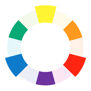
When you mix each primary with its nearest secondary, you get six further tertiary colours.
- Yellow and orange make yellow-orange.
- Red and orange make red-orange.
- Red and violet make red-violet.
- Blue and violet make blue-violet.
- Blue and green make blue-green.
- Yellow and green make yellow-green.
We use the tertiary colours to fill the remaining gaps in the wheel. These add up to twelve basic colours with which you can mix countless others.
Here is our colour wheel again with all those relationships labelled:
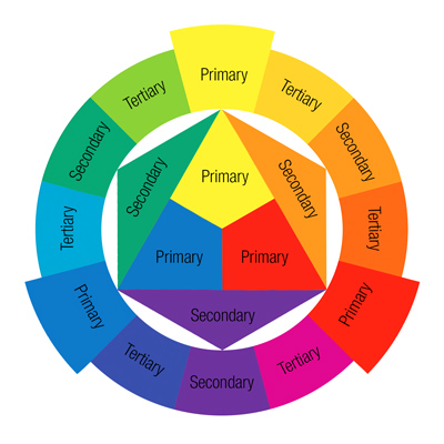
By diagramming the relationships between colours, the wheel helps us to devise colour schemes. The closer together colours are on the wheel, the more similar and harmonious they are, since each hue contains some of the hues next to it. Colours that are more separated are less closely related. Colours that are opposite each other on the wheel form the strongest colour contrasts.
All looks pretty neat, right?
Problems with the colour wheel
The RYB primaries, and the colour wheel based upon them, are still taught to this day. However this approach is based upon an understanding of colour that became outdated in the late nineteenth century.
The RYB colour wheel is a legacy of the early days of colour research, when artists didn’t have the range of pigments available to us and the different sorts of colour relationships (e.g. psychology, light and pigment) weren’t understood. During the nineteenth century, the discovery of opponent pairs and the differences between mixing light and mixing pigments revealed that a single colour wheel couldn’t represent the relationships correctly for all cases. As David Briggs puts it:
The historical primaries, Y, R and B are the three names that we generally applied to our best primary colourant hues when we first discovered them, before it occurred to us that the hues we mentally experience as pure and primary might not be the same as the optimal primary hues for colourant mixing.
Dimensions of Colour – The historical primaries: yellow, red and blue
A colour wheel needs to represent either additive or subtractive mixing: either the world of light or the world of paints. For painting, the optimal subtractive primaries that offer the widest gamut are actually cyan, magenta and yellow, a reality recognised by the print industry long ago. RYB lives on amongst painters because of outdated teaching and sheer habit – we’re accustomed since pre-school to thinking of red and blue, rather than magenta and cyan. RYB can be seen as the psychological primaries with green missing, or as an inaccurate approximation of the subtractive primaries from a time when there were no satisfactory cyan and magenta paints. They have never, as painters will tell you, been able to mix ‘all other colours’ satisfactorily, especially greens and purples. Most artists who use RYB primaries ignore the theory when necessary and rely instead on their practical paint-mixing experience to get the palette they want. Nowadays there’s no good reason to persist with RYB.
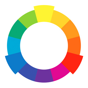
The CMY wheel
We can improve on the traditional wheel if we take CMY as our three equally spaced primaries. Red, green and blue become our secondaries and we fill the gaps with intermediate mixtures, giving us the CMY-based colour wheel:
We may alternatively call this the CMY-RGB wheel, or follow the artist James Gurney in calling it the ‘Yurmby’ wheel, roughly after the letters of the colours going clockwise: YRMBCG. Gurney has produced a version which includes declining intensities down to grey, which you can see on his blog. This has the advantage of incorporating two of the three dimensions of colour (hue and chroma) instead of just one (hue).
When we compare the results from RYB and CMY primaries we notice that the CMY-derived colours are more brilliant, especially in the greens and purples. Below are two examples I painted in Photoshop:
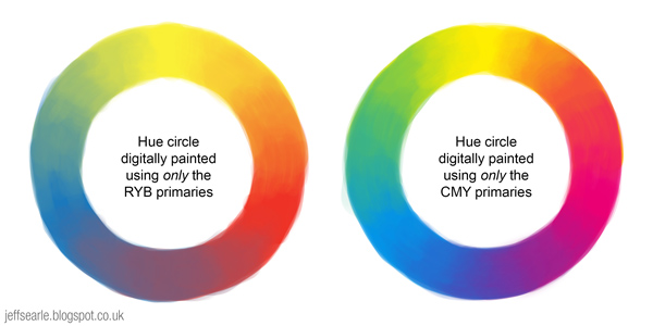
This proves that red is not a primary colour, because we can mix it using yellow and magenta, and that blue isn’t one either, because we can mix it using cyan and magenta. The CMY wheel is still somewhat arbitrary, for example because the CMY hues are spaced evenly at 120° for the sake of symmetry not because it’s scientifically ‘correct’. But it has the advantage of evening up the spacing of the colours – the traditional wheel gives disproportionate space to varieties of orange.
Admittedly even today there’s an issue with getting really good paints for cyan and magenta, though the options are much better than in the past. The best recommendations for the CMY primaries seem to be Lemon Yellow, Quinacridone Magenta and Pthalocyanine Blue.
You could think of the CMY wheel as a set of six primary colours. When we mix colours on opposite sides of the wheel they produce grey. This desaturating tendency also affects colours less far removed, meaning that the secondary colours we mix from two primaries will suffer a certain loss of saturation. A sensible response is to choose primary paints for the secondaries as well, giving us a six-colour palette. Of all palettes based upon a limited set of primaries, this is probably the best. If you think such a palette is crowded or expensive, keep to the three CMY primaries.
Primary colours in paint-mixing
Having said all this, don’t get hung up on the intricacies of colour wheels and their ‘colour primaries’. As Goethe said, “theory is grey, my friend, but the tree of life is forever green”. While a limited palette can be both instructive and satisfying, not to mention less expensive, there is no rule that you may only paint using three primaries plus white and black. If you are using CMY primaries but want to include burnt umber or any other paint in your palette, e.g. to save mixing a brown when you can get it straight from a tube, then include it. You are not an inferior artist for doing so. Similarly, the three CMY primaries offer a wider, brighter gamut than the RYB primaries, but if you have always used RYB and are getting the results you want, you’re welcome to stick with it.
In fact you can use palettes with no primary colours at all. Primaries can inform you about how colours are made and help you make decisions, but they have limitations. No three primaries, whatever they are, can mix all visible colours. Artists use them because 1) it is traditional to do so, 2) they offer a limited palette within which all the colours have a certain relationship, and 3) it’s useful to be able to define colours in terms of precise proportions of one primary to another, in the same way that universal Pantone swatches are useful to printers.
The print industry uses CMY (plus K) as a standard because keeping to just three primaries is more cost-effective and those are the three that allow the widest gamut. Six-colour printing for example offers a bigger range of crisper colours, but is more expensive. If printers could use six primaries as a standard for little or no extra cost, they probably would.
Incidentally people sometimes claim that CMY is for printing, not painting. This is incorrect. The CMY system works equally for both paints and inks.
Colour wheels and their limitations
Colour wheels too have their limitations. The point of a wheel is to organise colour into relationships. They impose symmetry and order upon a messy subject, but distort it in the process. No wheel is entirely reliable as a guide to mixing paints. Additive mixing can be conceptual and geometrically exact, but the forced geometry of a colour wheel misrepresents the realities of subtractive mixing, which has to take into account the irregularities that arise when using physical substances with different chemical makeups. When we combine substances that reflect and absorb light differently, we don’t always get the results theory leads us to expect (Bruce MacEvoy calls this substance uncertainty.) Practical experience is better.
Artists also have to deal with the imbalance in available pigments: there are lots more paints in the yellow-orange-red range than there are on the blue-green side of the wheel, and the historical dominance of the misleading RYB system means there few paints that even have the names of cyan and magenta, or you get paints like Cerulean ‘Blue’ which is actually cyan.
 |
| The CIE 1931 xy chromaticity space |
Complementary colours
Complementary colours are hues placed opposite each other on the colour wheel, making them balanced or antagonistic depending on your point of view. These pairs are especially high contrast, each hue making the other seem more bright and intense when placed side by side.
In the additive mixing of light, the primary colours are RGB. The secondary (i.e. made from two primaries) colours are cyan, magenta and yellow. These secondaries are the complements of the primary colours opposite.
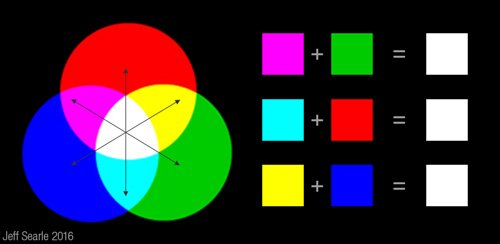
Why do we call them ‘complementary’? In additive mixing, the three primaries combine to create white. It follows that if we add a primary colour to its complement, which is a mixture of the other two primaries, they will combine to give us the full triad. Cyan for example is a mixture of blue and green; when we add red they complete or ‘complement’ each other, to make white.
I’m discussing complements in terms of primaries because it’s simple and those are the pairs that are constantly evoked, but any colour positioned directly opposite another on a colour wheel is a complement.
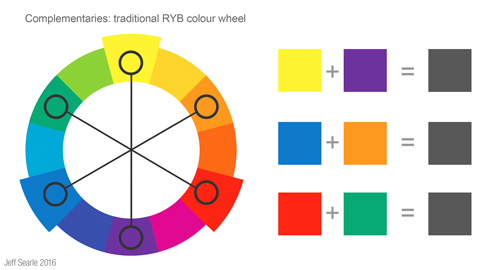
What about the subtractive mixing used in painting? These combine to create grey or black. On the traditional colour wheel below I’ve picked out the main three pairings: yellow and violet, blue and orange, red and green.
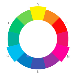
What if we’re using a CMY wheel? Here the complement pairs aren’t yellow/violet, blue/orange, red/green. They’re the same as the additive complementaries: yellow/blue, cyan/red, magenta/green:
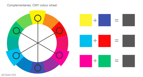
Neatly, the primary colours of light are the complements of the primary colours of paint and ink, and vice versa. Here again we see how the colours complete or ‘complement’ each other by adding up to the three primaries. Two examples. On the RYB wheel: in the orange/blue pairing, orange is made of red and yellow, plus the blue gives us RYB. On the CMY wheel: in the green/magenta pairing, green is made of yellow and cyan, plus magenta gives us CMY.
On other wheels – such as Munsell’s ten-hue wheel, or a wheel based upon the four psychological primaries and opponent hues (red, green, yellow and blue) – you’ll get different pairs again. The difference between these subtractive systems can be puzzling. Art teaching routinely asserts that the complement of red is green, not cyan. How can there be different sets of complementary colours? Which is right?
Visual vs mixing complements
There are two kinds of complementary colours. Visual complements are based upon additive mixing and tell us which colours create the most powerful visual contrast. Mixing complements are based upon subtractive pigment mixing, whereby we can mix a colour with its complement to create a nice range of muted or neutral hues all the way to grey. As it turns out, the optimal complements in these two cases are not the same. The best pigment complement for mixing yellow down to neutral and grey hues is violet, but the best complement for creating a striking visual contrast in a picture is blue.

The reason why they differ lies in the complexities of mixing pigment substances together. By the way, these colour contrasts work regardless of whether it’s on a screen or on canvas. It’s still yellow/violet or yellow/blue either way.
The traditional complements roughly hold true for pigment-mixing purposes. However, when making colour choices for how their artwork looks, artists should put the visual complements first. Our colour decisions should centre around what a viewer will experience when they see the finished artwork, not on the process the artist used to mix greys.
This leads us to a conclusion that can be rather startling the first time you realise it. The traditional complementary pairings that are taken for granted by artists, designers and others across the world are misleading. Red isn’t really the complement of green: add red and green light and you get yellow, not white. Modern colour theory tells us the complement of red is not green, it’s cyan. The complement of yellow is not violet, it’s blue. The complement of green is not red, it’s magenta. We are so used to the ubiquitous traditional pairs that most sources simply regurgitate them.
We can test the true complements by studying after-images. Try it yourself using the flag below (click to enlarge the image if you like). Stare at the black star in the flag on the left for half a minute, without looking elsewhere. Then switch your gaze to the white space on the right. Don’t forget to blink.

What is happening is your eyes are being desensitised to the three colours in the flag till they respond instead to the visual complements of those colours. Cyan becomes red. Yellow becomes blue. (You can try more after-images here.) Visual colour experiences follow the additive complements, not the paint-mixing ones. This is why the filters in 3D glasses for example are red and cyan.
There are various ways of approaching colour: psychological response and pigments and optics don’t all work the same way. Thus, like most colour theory, complementary colours seem simple but get confusing when you study them properly. Add to that some outdated but persistent ideas, and imprecision over the exact hues being used, and you find yourself picking through a minefield.
Is it ‘wrong’ to use the traditional complements? Well, they’re not true complements by the modern definition. The highly respected colour theorist David Briggs, whose Dimensions of Colour is a must-read, is quite stern about them:
The orange/blue, red/green and violet/yellow complementaries are part of a very simplistic and antiquated approach to colour theory that was revived in the 1970s when the teaching of the technical elements in art education reached its lowest point. The sooner they are dropped entirely the better!
Comment on a ConceptArt.org forum thread, April 2014
They are correct within the (flawed) framework of the RYB colour system, and artists have used them for centuries without provoking a crisis in art – many renowned paintings rely on them for their effects. They still produce striking contrasts, and they aren’t a million miles away from the correct visual complements. The CMY wheel supports blue/orange complements too, so there is familiarity in that; the yellow-green/violet pair isn’t so far from the traditional yellow/violet, and the red/cyan pair is more familiar than it looks, since cyan is greenish by nature. So although today’s artists are best advised to use the actual visual complements, in my view we shouldn’t get hung up on the traditional ones being wrong.
Let’s have a closer look at what we can do with visual and mixing complements.
Visual complements
We can put complements side by side so that each makes the other more vivid. Many artworks make powerful use of such a colour scheme (though the effect is not necessarily pleasant). Van Gogh offers lots of examples:

Van Gogh: The Night Café at Arles, 1888.
This sort of colour scheme is vivid, even fatiguing, so artists will sometimes emphasise one colour more, and use the other one in smaller amounts or with lower saturation. Rather than using complements for an entire painting you can use them within a more muted colour scheme, exploiting the contrast to draw the viewer’s attention to a particular area. In the Van Gogh above, there is as much dull yellow as there is red or green.
Mixing complements
Mixing complements of course are for when we mix paints together. When we mix additive complements they make white. In subtractive mixing, it follows that complements combine to form grey or black. Technically they should always add up to black, but generally do not because of complications in the mixing of actual substances instead of ‘ideal’ colours.
Mixing a paint with its complement will make grey. Don’t assume that a half-and-half mixture will do. The exact measures you need depend on the pigments. Of course you could just mix black and white if you want grey, but with complements you can choose a balance between the two: adding only a little of a complement will mute the base colour, offering a nice range of neutral hues (it’s churlish to call them 'mud’).
The light in shadow areas typically takes on the complementary colour of the main light, so you can take advantage of this by mixing complements to paint shadows, judging whether you’d like them warmer or cooler.
Of course, when using physical paints we have to consider the practical realities of substance uncertainty: the mixing of pigments to grey can be inconsistent. Translating the perfect complementary pairs we can create conceptually to specific paints can be problematic. Exactly which yellow, from the paints available, is complementary to exactly which violet? The relationship can only ever be approximate, and in practice, individual paints can work as mixing complements for several paints on the other side of the wheel. The best thing is to get your paints out and learn what works through experiment.
If you’re painting digitally then you are spared these paint-mixing issues. You can easily find a colour’s complement in your colour picker by amending the H (for ‘hue’) value by 180°, i.e. the exact opposite side on the hue circle. In Photoshop it’s presented as a hue strip but it works either way.

Simultaneous contrast
When we put two colours side by side, their relationship changes the way we perceive them. This is called simultaneous contrast, of which complementary colours are the strongest example. Simultaneous contrast effects occur because our colour perception is not a scientific instrument but is constantly readjusting and making comparisons. It seems to work pretty well, but it can play tricks on us too. Take a look at this illustration:

Image: Dodek (Wikimedia Commons).
The grey bar in the centre appears to get progressively darker from left to right; in fact the bar is the same colour throughout. The effect is an illusion induced by the gradient in the background. When we see dark and light colours next to each other, our brain makes the darks seem darker and the lights seem lighter.

In simultaneous contrast the appearance of a colour moves away from the surrounding colour in some fashion. Any of the three dimensions of colour – hue, value and chroma – can be affected.
- Juxtapose a colour with a lighter colour and it will appear darker, and vice versa.
- Juxtapose a warm colour with a cool colour and it will look warmer, and vice versa.
- Juxtapose a colour with a less saturated colour and it will appear more saturated, and vice versa.
- Juxtapose a colour with a solid hue and it will subtly shift its appearance towards the complementary of that colour.
These effects teach us that we shouldn’t only think of individual hues; we must take the relationships between colours seriously too.
Split-complementary colour
Instead of choosing the base colour’s complement, we can use the two colours on either side of the complement instead. This is known as a split-complementary colour scheme:
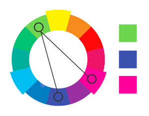
We still get contrast, but within a scheme that is less intense and less potentially jarring.
Analogous colour
Analogous colours – usually three or four hues – sit next to each other on the colour wheel. Their closeness means they share similar colour elements, helping them to work harmoniously together.
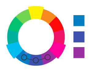
When creating an analogous colour scheme, we normally choose one dominant colour and recruit a couple more as support. Mixing the supporting colours with the main one, along with black, white and grey, gives us a subtle, low-contrast range of colours pleasing to the eye.
Colour temperature: warm and cool
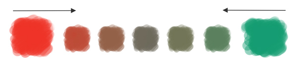
Colour ‘temperature’ is an important kind of colour contrast that entered art theory in the 18th century. We can divide the colour spectrum into two broad camps: the warm hues of yellow, red and orange and the cool hues of blue, purple and green. Warm hues are meant to be more exciting and engaging, cool hues more calm and receding (think of the bluish cast of distant mountains).
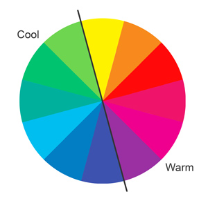
The point is to manipulate the contrast to excite the viewer’s eye, perhaps only in a subtle way, but enough to make the image more interesting and to hold and direct the viewer’s attention. As opposites on the colour wheel, complementary pairs always have one warm and one cool colour.
Artists are welcome to argue about where the dividing line should be drawn. ‘Warm’ and ‘cool’ are not cast-iron concepts, with a precise boundary. They are psychological and open to interpretation. We can probably agree that yellow, orange and red are warm, and that blue and blue-green are cool.
We can use warm and cool colours to create contrast by putting them side by side. For example, you can use this effect to enhance the sense of depth in your picture. If you put an object painted in warm colours (such as a person or a pair of oranges) in front of a background of cool colours (such as a landscape or a room), the warm object will jump out more vividly. In Café Terrace at Night (1888), Van Gogh exploits the contrast to make the café look especially lively and inviting:

Is purple warm, because it contains red? Or is it cool, because it contains blue? Actually it can be either, depending on the context: contrast it with an orange hue and it will go backward, contrast it with a blue and it will come forward. Similarly, individual colours have warmer and cooler versions: we may have a cooler red (leaning towards blue) or a warmer red (leaning towards yellow). In a bluish landscape a patch of green might be the warmest colour in the picture. It’s not that some colours ‘are’ warm and others ‘are’ cool. It’s more useful to say that colours tend to be warmer or cooler relative to other colours in the picture.
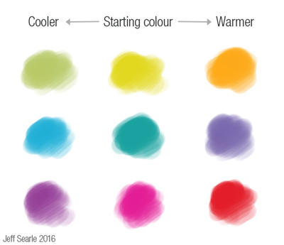
You can make a warm colour cooler by shifting its hue closer towards the cool half of the spectrum, and vice versa:
For a different kind of mood you can use colours entirely from the ‘warm’ or ‘cool’ halves of the spectrum in both foreground and background. You could then choose warmer or cooler versions of those colours for contrast and depth.
The temperature of a colour depends on your main light source. A common rule of thumb is to pair warm light with cool shadow, or cool light with warm shadow. Light doesn’t necessarily obey this simple formula every time in real life, but harnessing the contrasts of complementary colours creates a vivid painting. Direct sunlight and incandescent lighting tend to be warm, and thus pair effectively with cooler shadows. Outdoor shadows tend to be bluish because they pick up the ambient blue of the sky rather than the white-yellow glare of the sun that is lighting the form.
What next
When we paint, what matters is the relationships of the colours in the painting. Understanding these dynamics will help you make your colour choices. From an artist’s perspective, the point of theory is to help us paint better. Over the last two articles we’ve established that colour is a complicated matter, further confused by a lot of misconceptions. The best approach for artists is to complement theory with the lived experience of colour.
As an exercise try painting colour wheels, as you will learn much more about relationships and mixing behaviours than you will from looking at a diagram. Begin with the primaries, then add the secondaries, then add the tertiaries. The way to learn colour mixing is to mix real colours, in the medium or media appropriate to your work.
I stumbled across this from searching for things about the Yurmby colour wheel but there's so much more than that here. Thanks for taking the time to put this really informative post together.
ReplyDelete