|
| Ivan, by Jeff Searle |
The techniques apply to painting any kind of face: male, female or humanoid alien, and much of it will apply to non-portraits too. In that sense it should be helpful as a general guide to making any digital painting. I will assume you have a reasonable knowledge of Photoshop or similar software*, and are painting with a graphics tablet. In earlier articles I have already discussed the anatomy of the head and the drawing of individual features so I won’t repeat all that more than necessary. I’ll refer to the person being painted as the ‘sitter’ but let’s face it, you are unlikely to have an actual person posing next to your computer – the person in my painting is imaginary and that’s fine too.
There are many ways to paint a portrait. No doubt some are more efficient and effective than others, but obviously you can experiment and paint however you want. These aren’t rules. Treat any tutorial as a set of guidelines to help you find your own way.
1. Preparation
To make a successful painting we need a decent idea. Put some thought into your concept, clarifying who is sitting, his or her character, and the mood you’re trying to achieve. Because this is a portrait tutorial we will focus on a head and bust, but you’ll need to consider your background too. Will the sitter be put against a neutral colour and texture, like a photographer’s backdrop? Will they be in a room, in a garden, in their workplace?
If you’re using photo reference, ideally it should be good quality with clear lighting, preferably from one main light source. The less suitable the reference, the more you will have to rely upon your own creative resources.
Some artists do only minimal preparation. Digital artist Daarken writes:
“When I start a painting I usually have no idea what I’m going to do or what it will look like... I have a basic idea of the angle that I want to paint, but that’s about it... I make a lot of changes throughout my painting. Not starting out with a tight drawing allows me to try different things more freely and to let ‘happy accidents’ happen.”
Digital Painting Techniques, 2009
Personally I like to know where I’m going, but inevitably some of your decisions will get made, and remade, as you go along.
Setting up
When you’re ready to start, create a new file in your software. When choosing a canvas size, you need to think about what the final output will be. Will your image be used for print or only on the web? A print image will need to be at higher resolution than one intended to be shown online. Consider painting your picture at a bigger size than the one it will be reproduced in.
Some artists start on a full-size canvas right away, with a dimension of say 1500 to 4000 pixels on the longest side. Others start small for the early roughing-in stages, say 500 to 800 pixels, then upsize later when it’s time to refine the image – this is good for less powerful computers and encourages a looser way of working in the earlier stages.
If you’re not sure what size your finished painting should end up, find digital paintings online to compare with. Also, learn from your finished work. If it looks pixellated you may decide you needed a higher resolution to get the results you wanted; conversely you may find you made it too big and can reduce it without loss. With a bit of practice you’ll get an idea about resolutions and file sizes.
I would avoid a white canvas: it is a bit less comfortable to stare at while painting, and it will distort your sense of colour, since colours look darker against white. Choose a neutral canvas colour. The canvas influences your skin tones, as it sits next to them and may partly show through the colours you paint on top of it, rather like in traditional painting. If you already have a colour scheme in mind, you could choose a colour that sits nicely with it, either harmonising with the intended foreground or contrasting with it.
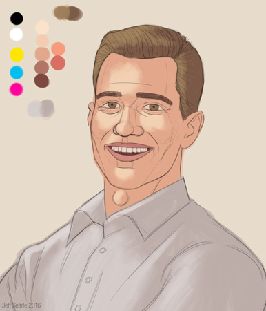
For my painting, to help create a genial mood I decided upon light clothing and a light background, the head therefore looking relatively dark. I wanted a neutral warmish colour, giving me this exciting canvas:

Name your file, save it, and keep saving as you go along. It is a terrible thing to lose hours of work thanks to a butterfingers moment or an inopportune lunge by the cat.
A note on image resolution
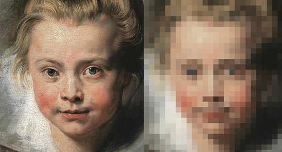
The dimensions of an image are measured in pixels, e.g. a 600x800 image is 600 pixels wide and 800 high. The more pixels there are, the higher the image’s resolution, i.e. the more information the image can contain. A lot of confusion comes from two terms, ‘DPI’ (dots per inch) and ‘PPI’ (pixels per inch). These terms refer to printed output, not the quality of the digital image itself. The resolution of a digital image is simply its dimensions in pixels.
2. Sketch
I normally begin with a preparatory drawing. A sketch is a great way to plan out your framing and composition, and proves an invaluable guide while you’re painting. You can draw this directly on the computer or you can use traditional media and scan it in. Once you have your sketch on the computer, drag it onto its own layer in your Photoshop file. You may want to clean it up a bit – using the Levels to obliterate grey values is a neat way to remove any unwanted fuzz. Set the blending mode of the sketch layer to Multiply. This will turn the white transparent, allowing you to work on layers below the sketch and still see what you’re doing.
Alternatively you can draw your sketch directly in Photoshop. Simply create a new layer and name it, then using a small, hard brush, sketch the essential forms of your sitter, beginning with the basic forms, selecting the size, the tilt of the head and shoulders, then blocking in the features. It doesn’t really matter what tool you use as long as you get a useable sketch at the end of it, and it’s up to you how detailed the drawing is. As I say, personally I like to know where I’m going, so I prefer a precise, complete drawing as mistakes are easier to correct at this stage than they are halfway into a painting. Here is the sketch I drew for my example. I thought I’d keep the sitter – let’s call him Ivan – pretty straightforward:
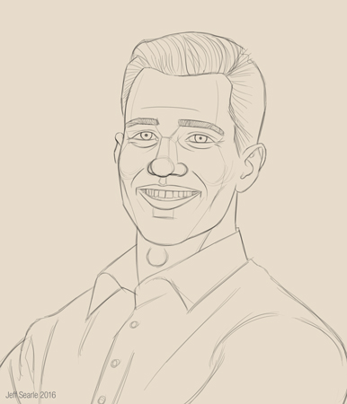
Digital art is awash with fantasy girls, generically pretty and gazing at nothing as if they’d never had an emotion in their lives. The main thing for me was that my sitter, though imaginary, should look like a real person. For simplicity I’m going to leave the background neutral.
Note how the slopes of the shoulders act as directional pointers to his face.
If you want to know how to sketch a head, look at my earlier articles in this series on the head. In my example I have indicated a couple of plane changes but haven’t explored values at all, i.e. how light and dark different areas will be. You may prefer to make a monochrome (which means one single colour, not necessarily black and white) study or studies to explore that, or other aspects, before you start.
Take advantage of your medium. You can move your sketch around to test the framing and use tools like Warp or Liquify to adjust it until everything looks right. Flipping the sketch to see it in reverse often shows up problems you didn’t notice before. When you’re done, lock the layer as this will prevent you from painting on it by accident.
Again, save your work. You can save multiple versions as you go along if you like.
3. Establish your light
Painting is all about light. For this tutorial we will assume the sitter is lit by a regular diffuse daylight coming through a window. You must decide from the outset where your light is coming from. It’s best to keep this simple. Once you’ve chosen a direction, you will know which areas of the head will be in light and which in shadow.
The typical light for a portrait tends to come from the top left or right. That is the light we’ll use here. You don’t have to paint this in – these pictures are just for illustration. The planes that face the light source will be lit up, and the planes that turn away from it will be in shadow. We also need to think about any cast shadows, such as the shadow of the head on the neck and under the nose. Remember to think of the head as a three-dimensional block.
Define 1) the key light i.e. the principal and most intense light source, and 2) the fill light, which is less intense and comes from a different direction. You may also have 3) a back (or rim) light coming from behind, which will add a white highlight to the back of the head and, in our demo, also make the ears red because of the subsurface scattering.

The reason for having various light sources is to mimic what happens in nature, and make the painting more realistic. But you don’t have to use three. If it helps, you can try copying a light scheme from another painting.
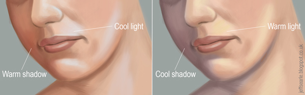
Let’s go with a cool light and warm shadows.
Contours
We paint in two dimensions, but a human head exists in three: its forms project into space, with rises and depressions like a landscape. It may help you to create a new layer above the sketch and draw in some contour lines, a bit like a 3D mesh, to make you think about the head’s structure.

Even if you don’t actually draw in the contours, to depict three-dimensional form convincingly you need to be thinking of them while you paint. Like planes, they show you how the form will respond to light. Areas facing a light source will be lighter, areas turning away from it will be progressively darker.
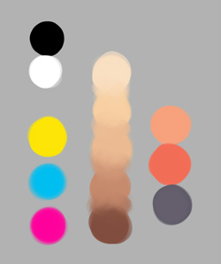
4. Create a palette
Let’s get started. You need a palette of colours to work with. Put it on a separate layer so you can turn it off when you don’t need it. First you are going to need white and black, plus the primaries of yellow, cyan and magenta. From this basic starting palette you can mix the colours you need.
Make a basic skin tone using magenta and yellow, with a little white and black. Then mix a lighter tone for the lit areas, using the skin tone but with a tiny touch of blue for the cool light.
For the shadow tone, darken the basic skin tone with a touch of black and of the complement: we have a cool light so add some red-orange to the shadow. Shadows are generally less saturated, so reduce the Saturation a little.
You will also probably need a variant of the flesh tone with some extra red in it, e.g. for the lips and cheeks.
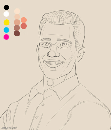
There’s no need to go crazy. A small range of colours will do for now. You could prepare an entire palette before you start painting, but in practice you will develop it as you work.
Remember, it can be tempting to go for strong colours to make the portrait ‘vivid’, but muted colours are more realistic. Avoid using the same palette every time, otherwise your paintings will all resemble one another! Don’t use plain black and white for lights and darks.
5. Block in the basic colours
The next step is to block in the basic colours. The principle is to work from simple to complex: we start very simple then build up layers of detail, to the level you want to achieve.
Create a new layer under the initial sketch and call it ‘flesh’. Stick with a large, hard round brush with a high opacity and use your new palette to block out the main skin colour using a medium tone. Keep it rough at this stage and focus on getting the colour in the right place, without being overly fussy about staying within the sketch lines. You could try using a brush below 100% opacity, to give the background a chance to show through a little.
Keeping to my plan of a light background and clothing, Ivan’s shirt is a warm grey.
Block in every basic colour in the image, not just the face: gradually bring up the whole picture together. Block in the hair and clothing on their own layers. Things like glasses and jewellery are best created on separate layers too so you can still work easily on the eyes and skin underneath.
A note on brushes
I am mostly using just the basic hard round Photoshop brush. Apart from blocking in I will keep it at low opacity, say 20+%, and build up colour gradually with repeated brush strokes. Some artists like to have an immense array of custom brushes, which is fine if that’s how they like to paint, but you don’t need them. If you don’t understand form, light and colour then no clever brush will save your painting.
6. Light and shadow
On a new layer or layers, paint the areas of light and shadow where they would naturally fall. Think about your light sources, the contours of the head, and the planes of the head. Remember the rule of thumb: warm light/cool shadow or cool light/warm shadow. Here I’m opting for the latter. You don’t need to be precise at this stage – just block the colours in with a large hard brush without zooming in.
Begin with the lighter areas. Begin with the basic flesh tone but mix a lighter version that fits into the lighting of the whole image. If you want the scene to be lit by a cool light, tend towards the ‘cool’ half of the spectrum.
Now apply the basic shadows, including cast shadows.

If the colours on your palette don’t seem quite right, at any time in the process you can adjust them.
Note that by ‘cool’ light I don’t mean ‘make all the lights blue’, though it could mean that – I mean shift them towards the cooler side of the spectrum. Same for the darks. Rather than use just a lighter shade of the flesh I’ve shifted the colour of the lights to be more yellow (heading towards the cooler shades, of green, etc) and the darks towards red. What I’ve done here is really subtle – you might want to emphasise it more.
Background
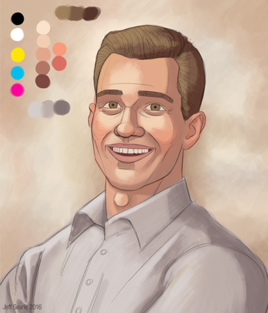
Think seriously about the background of the painting. Both sitter and background need to complement each other. Here we’re going to keep to a simple, neutral background, but even so, if we leave it as one solid colour it will look artificial. Work some lights and darks into your background and give it some texture. We can work on it a bit more later, but it’s good to establish our intended scheme of light and colour early on. My plan was to make both the background and clothing quite light, allowing the head to be the darkest area and keeping the whole painting fairly breezy.
To help the whole painting hang together, we can include colours from the flesh and clothing in the background, and vice versa. For example, the background could pick up the same colour as the fill/back light. I’ve included a hint of grey in the background and a couple of beige touches on Ivan’s shirt.

At some point you may want to reduce your sketch layer to about 20-30% opacity so it can serve as a guide without obscuring what you’re doing. Unless of course you want the line art to be part of the finished image.
A note on layers
Layers are one of the main advantages digital painting offers over traditional media, but it’s best not to over-use them. Too many layers in your file may slow down your computer and will complicate your working process. Try to keep basic elements like the hair and the eyeballs on their own single layer or on just a few layers within a subfolder. When you paint new elements, it’s a good idea to paint them onto a temporary layer first, then flatten it into the main layer when you’re happy – this lets you test how the painting looks ‘with’ and ‘without’, and makes it much easier to abandon something when it doesn’t work.
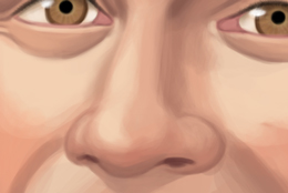
7. Facial colours
The human face is made of many colours, so for additional realism mix some colour variants, for example with extra red and yellow. Don’t be afraid of using complementary colours that you don’t normally notice in people’s skin, and experiment with blues, greens etc – the result will look natural once they’re blended in. Again, keep to fairly broad brushwork at this stage. Use new temporary layers until you’re satisfied.
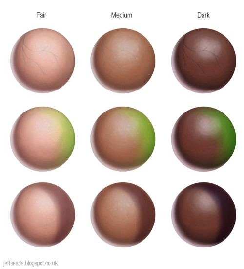
Remember the three colour zones: faces tend to be more yellow around the forehead, red around the middle, and blue/green/grey around the mouth, though this is an extremely subtle effect and not mandatory.
In my example I’ve kept my colours conservative, adding some red to the cheeks, tip of the nose and ears, some yellow to the forehead, and some blue-grey to the chin:

Consider whether any colour will be reflected from the clothing onto the skin next to it.
I’m going to leave the treatment of Ivan’s clothing fairly rough. This is a reasonable strategy for a portrait, where the focus of attention must be the sitter’s face.
8. Consider amendments
Before you get into details, you may want to adjust and correct the proportions and layout of your portrait, for example by amending selections with the Warp or Liquify tools, or Edit > Transform > Distort. Make sure you’ve captured the expression you wanted, and flip the image again to check for problems.
The Warp tool allows you to select an area and click and drag the handles of the Warp grid to stretch or compress it in the direction you pull. The most versatile tool is Liquify, which you can use at any time to adjust your painting and correct mistakes. The advantage of working digitally is that if you go wrong or change your mind it’s easy to make changes. You can also easily afford to take risks that might cost you hours to undo in traditional media.
I decided I wanted to emphasise Ivan’s alert good nature a bit more, so I opened his eyes slightly wider and raised his eyebrows. I also adjusted his collar a little on the right so it balances up better. I’ll turn the sketch layer opacity back up so you can see better.
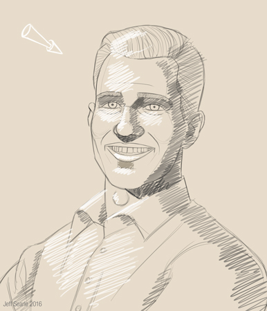
Now let’s check the proportions by flipping it:
Hm, the line of the shadow on his right cheek needs to come forward, so might as well correct that and flip it back:

If you started with a small canvas, now is the time to increase the image to its final pixel size, as we’ll be doing more detailed work from now on.
9. Features
It’s time to define the facial features. These will make a big difference to how your painting looks. We’ll do a first stage of work then refine them later.
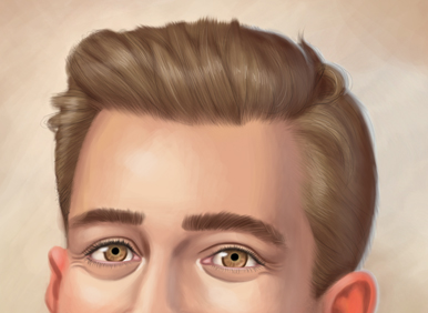
Eyebrows
I wrote a very short tutorial on eyebrows here. Eyebrows are not thick lines drawn on the face – not normal ones anyway. They are composed of lots of little directional hairs.
Eyes
Use lights and darks to model the structures around the eyeballs: you can refer to my full eyes tutorial here. Avoid drawing dark outlines around them if you don’t want it to look like the sitter is wearing heavy makeup.
I like to create a separate layer for the eyeballs underneath the flesh layer. Eyeballs shouldn’t normally look solid white. Instead, paint the eyeball in a greyish hue with a bit of the skin colour mixed in. Paint in a round iris and add the black pupil. Irises have dozens of tiny radial streaks in them – indicate these with a small opaque brush. They have a dark edge known as the limbal ring. We can refine the irises further later.
The eye shouldn’t look flat: it is a sphere set in a socket, so the corners tend to fall into shadow and are darker. The top of the eye curves away from the light and falls into shadow from the upper eyelid, so it will be darker there and across the top of the iris. The spherical eye affects the eyelids too, which will be lighter where they bulge out and darker in the corners.
Add a small cool highlight to each eyeball, placed in the direction of the main light source. This is very important for adding some life to your sitter. I’ve made a simple indication of the eyelashes too, which we will refine later.
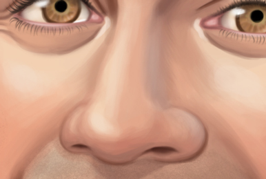
Nose
You can refer to my full nose tutorial here. Define the basic structure of the main wedge of the nose, the tip and the wings.
Mouth
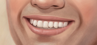
You can refer to my full mouth tutorial here. Block in the lips with a reddish colour, then apply some basic lights and darks to mould the mouth shape. The upper lip will be a bit darker.
If the subject’s teeth are showing, block those in – again, they will not be solid white, and will fall into shadow particularly in the corners and under the upper lip.
Remember that not everyone has ‘perfect’ features. Faces aren’t always symmetrical; women aren’t always beautiful; sometimes teeth are crooked or yellow or missing. Don’t try and turn everyone you paint into a digital robot. I’ve given my sitter a wonky tooth.

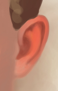
Ears
See my full ears tutorial here. So that I can demonstrate it, my sitter’s ears will glow with subsurface scattering, which means adding some bright orange to the ears.
Hair
Thus far we’ve simply blocked in the basic form of the hair. Hair can help you direct the viewer’s eye, especially if it’s long and flowing, so it needs to be organised. Even short hair shouldn’t necessarily shoot off in distracting directions. Don’t draw locks randomly – decide where they are going to go.
Strands of hair tend to group together in locks, so at this stage identify the locks and shade them like individual forms with light, half-tone and shadow. Keep it broad for now.

Your sitter may have facial hair. Ivan doesn’t have a beard but I fancied adding some stubble. You can do this by painting some grey around the chin or, like I did, you can use a speckled or textural custom brush.
Clothing
I don’t really need the sketch any more, so I painted in some of the details of the shirt then turned the sketch layer off. I’ve made the background slightly more emphatic too.
OK, now it’s starting to look like a portrait:
Don’t forget to keep saving. Again, you can make amendments as you go, and use your Photoshop tools to adjust forms and colours. It’s OK to make mistakes along the way. It’s digital, so they are easy enough to correct, and making mistakes is how you get better.
10. Blend the colours
The painting’s coming together. Let’s start to refine it.
Begin by blending together those rough colours on the hair, face and clothing. You will still need to go to your palette at times, but more and more you can simply sample colours from the painting itself. If you prefer to blend colours as you go along that’s fine of course – I’m just breaking the process down for teaching purposes.
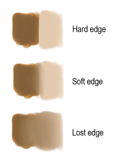
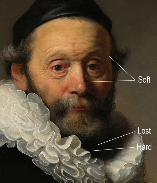
Use a low (say, 15-30%) opacity hard round brush. Avoid the Smudge tool because, at its factory settings at least, it will take away the texture of your brush strokes. Use soft airbrushes with caution, as they give a very smooth finish that can leave your subject looking more like a porcelain doll than a human being.

I recommend saving the greatest detail and precision for the facial features, which communicate with us most, and preferring soft transitions for the edges of the hair and clothing. I can see Ivan’s hair needs more work in the latter regard. Keep adjusting your edges as you go along.
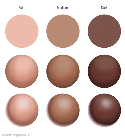
11. Develop the skin tones
Build up the lights and darks a bit more, using a lighter tone and darker tone than you used already. Think of how a change of plane can be marked with a change of colour and value.
Start with the lights and highlights. Normally highlights should be sparing. Avoid making them with pure white. Skin is slightly rough and diffuses reflected light, so highlights shouldn’t be too shiny-looking, unless the sitter is sweaty or wet.
Now choose a darker shade of the skin darks and use it to deepen the shadows. A dark brown with reds and other colours in it reproduces the bouncing light seen on a real head. Don’t forget inside the mouth. Strong contrast between the lightest and darkest areas will create drama. You can use the Burn tool at a very low exposure to darken areas: when set to ‘midtones’ it darkens the skin to a deeper brown and when set to ‘highlights’ the darker additions tend to be very grey. Some may sniff at using Burn instead of mixing the colours yourself but it’s just a tool. Work at a low opacity so the colours can build up slowly and with subtle transitions.
You need to direct the viewer’s eye towards what they ought to be looking at. For example, don’t distract them by putting too much detail in the dark areas. Consider emphasising the contrast around the eyes, which are one of the most expressive and revealing features and you will want to draw the viewer’s attention to them. If you have a live model, don’t be afraid to depart from what exactly you see – creating a striking piece of art is more important than being literally ‘correct’. Artists always edit what they see towards an artistic purpose.
12. Other light sources
It’s time to incorporate your back and fill light into the painting. Create new layers for them, then (optional) flatten them into the main flesh tone layer once you’re happy. Three-point lighting is not compulsory: if an additional light source adds nothing or even spoils the picture, leave it out.
Back/rim light
Create a very light colour in a cool hue, to match the cool light/warm shadow lighting scheme. On a new layer, paint a fairly hard line down the shadow side of the head and shoulders. There will also be some subsurface scattering manifested as red/orange in the ear, which we blocked in already. Use layer opacity to adjust the intensity of the rim light.
Note that rim light won’t necessarily be at the same intensity all the way along the person’s form. It will be brightest on the up-planes facing the light, and less intense elsewhere.
Fill light
Add the fill light to the side of the head. Use a light colour: you could try a slightly coloured light for interest. I kept with a light blue. At low opacity, block in the general pattern of fill light, thinking about what direction you want to give it and where it will strike. Then work over it again to bring out some highlights. Use a low opacity, soft eraser to make adjustments. You are aiming for a nice, subtle effect.
When you’re done, you can experiment with the colour of the fill light if you want. Go to Image > Adjustments > Hue/Saturation, and click Colourise. This will allow you to introduce some colour and to experiment with brightness and saturation until you have something that is just right.

13. Polish the features
Let’s refine Ivan’s features to finish them off. The reason we didn’t do the features all in one go, in stage 9, is because we are trying to bring the whole painting along in stages. We have made important amendments since we first blocked the features in, and we need to have those in mind.
I’ll look at each feature in turn. Note that for a realistic painting the little details, though they may not seem like much in themselves, all add up and can take your painting to another level.
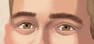
Eyes
The eyes are the most important feature, so let’s finish those first and take particular care over them. Paint the flesh of the tear ducts in red-pink and make it lighter in the centre where it’s moist. It’s easy to paint the bright highlight on the eyeball as a simple dot, but it can take other forms, the classic being an inverted white window i.e. the main light source reflected in the eye. There can be two or three highlights in different areas hit by the light source(s).
Spend time on the irises – make sure the limbal ring is dark, work on the streaks and add some other colours, for example blue eyes might also have grey, and yellow near the pupil.
Work on the eyelids, defining their shape and adding highlights. Eyelids have thickness, so remember the top edge of the lower eyelid, which may be a bit more fleshy in colour and possibly better lit. Add a light stroke near the inner corner of each eye.
On a new layer, carefully paint some eyelashes, using a soft round brush. Unless it’s a close-up, it’s enough to give a broad impression rather than try to paint every lash, so simplify them. The lashes tend to merge with the shadow under the upper eyelid to form a dark line. Paint them as blurry, simple shapes, a bit heavier at the base. Don’t draw them with identical length, direction and spacing, as this looks fake.

Women especially may be wearing makeup around the eyes.
Nose
Zoom in and see if you can make the nose more three-dimensional by working up the light and shadow, such as the shadow on the underside of the nose tip as well as the cast shadow upon the top lip. Keep the latter subtle or it will look like dirt or a moustache. You may want a highlight to the nose tip and down the bridge. The nostrils will be in dark shadow.
Earlier we added some fill light to the right-hand side of the face, so include those effects on the nose as well. Again, this will be more intense where the plane faces the light source, less intense elsewhere.
Mouth
The mouth still needs work. Remember the contours of the lips as you work. With a hard brush, add some light blocks of colour, following the curve of the form. The corners of the lower lip tend to be a bit less defined and merge into the flesh, so soften the transition there. Don’t forget the slight identations at either side of the mouth.
Shade the lips by applying darker shades to the down planes and areas in shadow. Make it a little darker at the centre of the lower lip. To adjust the entire lip area, create a new layer, paint in a colour then set the blending mode to Multiply. You may think the lips are too red or too dark, in which case add a new layer of skin tone then reduce the opacity until you’re happy with the adjustment.
Add some cool highlight to the top edge of the upper lip where it’s turned towards the light source, and to the lips themselves. Remember that specular light reveals a great deal about the material an object is made from. If your subject is wearing glossy lipstick, or their lips are wet, the surface will be more reflective and the highlights more sharp than on dry, natural lips (they will also be more intensely coloured of course).
If you want a bit of a moist look, using a light colour apply a series of small dots to the lips.
For the teeth, work up the shadow a bit more. The lines between the individual teeth are very subtle. Add some cool highlight where the teeth catch the light.
Hair
Paint in more strands, adding extra lights and darks. Make sure there isn’t a hard line where the hair meets the forehead – this can create a ‘Lego hair’ effect.
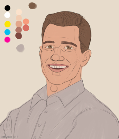
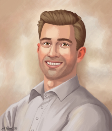
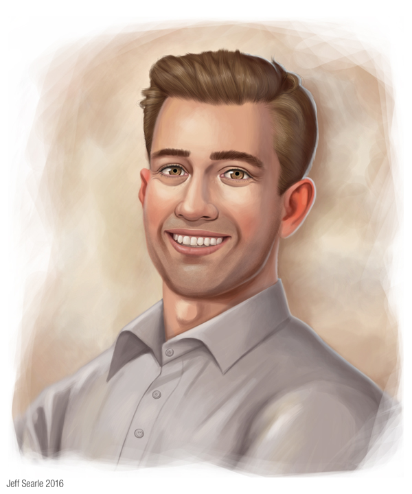
Here’s how the whole portrait now looks:
14. Finishing touches
We’re very close now. Just think about any last adjustments.
Light
You may want to check, tidy up and refine your lights, darks and highlights, increasing them in places, decreasing them in others. Check you didn’t forget any. You won’t necessarily see these on a live model and might invent some purely to make the image easier to digest and the forms more explicit. For example a bit of reflected light on the chin, or a deeper shadow below it, will help to separate that form from the neck.
You could add a very subtle bit of rim light to the lighted side of the head too, for added interest and realism (because in the real world there are usually multiple light sources).
Colour
You may want to have a final play with colour balance, saturation, values and so on. Perhaps the skin is too saturated, the nose is too red, or a strong colour juxtaposition is distracting the eye. The best way to make these changes is to make a temporary layer or duplicate the layer you’re changing, make the adjustment, turn it on and off and try out opacities to assess the difference, and flatten it once you're happy with the change.
There are all sorts of ways in Photoshop to adjust the colours on a layer, such as using Colour Balance, or Curves to adjust a specific colour channel. I won’t try to list everything. Thanks to such tools, you can easily adjust the colours in your painting.
Details
You may want to add a couple of little touches of pure, or nearly pure, black and white to push sharp details. Remember not to overdo detail in places where it doesn’t belong. If your sitter is wearing jewellery, for instance, you probably don’t want it so meticulous and dazzling that the viewer looks at that rather than the person underneath.
Edges
Go through the painting, tidying up edges where appropriate and roughening others. Sharp, shiny edges may be fine on glasses or other objects, but you don’t generally want them on human skin as this looks artificial. In general, a too-sharp and perfect outline doesn’t look very painterly and may detract from the sense of realism.
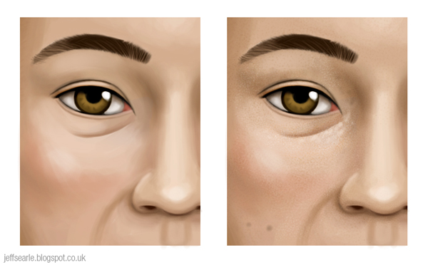
Texture
Real skin is not smooth and perfect. If you look closely it has a rough surface, with spots, freckles, moles, scars and blemishes. Whether you paint this, and how far you take it, depends upon your taste and on your sitter: the complexion of a spotty teenager will need more attention than a fashion model’s beauty spot.
On a new layer, dab on a few little marks, e.g. around the eyes, to suggest irregularities in the surface. Adjust the layer’s opacity and blending mode and keep it natural. You can use a speckled brush sparingly to recreate the porous roughness of human skin, though I haven’t done that in my painting.

Changes like these are generally best kept subtle. But if you paint subtle changes on a new layer then turn them off, you will see the cumulative difference they can make.
Use a hard brush to add a bit of roughness to your brush strokes on the face. Conversely, use a soft brush to soften any areas that look too rough, though you don’t want the finish to be overly polished and artificial.
Another idea for creating texture is to let your line art show as part of the final image, in a sepia or red tint and at low opacity, depending on whether you think it adds anything or suits your intentions.
Background
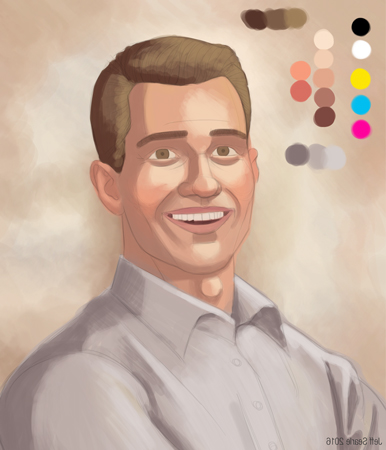
Cast your eye over the background and make sure it works. As I’m working with a darkish head with everything else underplayed, I’ve done a reverse vignette, fading out the outside edge, then increased the canvas size a bit to give the final image some room (giving me a canvas size of 2500 pixels wide by 3000 high). Also I’ve done some darkening behind the head and shoulders to bring out the rim light.
Final word
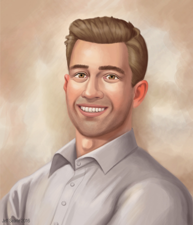
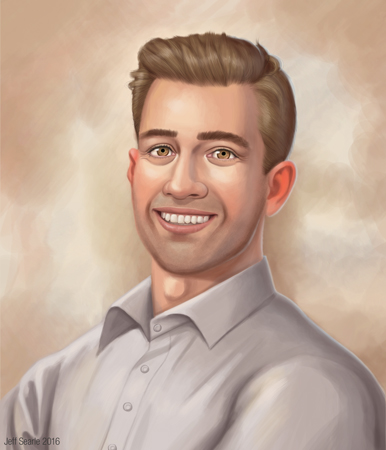
Take one last critical look at the piece, sign it, and save it. Here is my final painting of Ivan:
That was my guide to painting a digital portrait step by step. Obviously this is only one way of working. Other approaches are available, and you don’t have to do the steps in strict order. Get painting and find the way that works for you. If you use the same palette, the same light, and the same sort of sitter in every painting you do, they will end up looking identical and your body of work predictable. This guide is a starting point, not a rigid formula – my goal was to pull together the information in the two previous posts and show beginners how they might apply it all to an actual painting.
* If you need to learn about digital painting techniques you should try Matt Kohr’s website Ctrl+Paint. He has a huge and comprehensive set of free videos which will teach you just about everything.