Monday 12 September 2016

Portraits in colour

Returning to the subject of the human head, let’s look at how to apply colour to painting a portrait. I am coming from the perspective of digital art, but most of the observations below apply for any media.

Colours of the skin


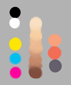
Beginners usually don’t realise how many colours there are in a person’s skin. A common mistake is to choose a basic flesh colour, then add white and black to create highlights and shadows respectively. 

Using this approach for a white person like me, you might end up with a palette that looks a bit like this:


This is basically a single colour gradient. Its lack of hue variation means the subject’s flesh will look dead, and the portrait boring.

Real skin is much more interesting. It can include blues, pinks, violets, yellows, greens and more. This holds less true for black people than for white people who have relatively translucent skin, but it is true of everybody to some degree. Look carefully at your own skin and you’ll see what I mean. This is before we consider colour reflected onto the skin from the environment, such as from brightly-coloured clothing, or from the light itself, such as the orange glow cast by a setting sun. So when you paint a portrait, by all means start with a base flesh colour, but remember to look for other, sometimes unexpected colours created by veins, hair, variations in skin tone etc. Three very simple suggestions might be:

  • A bit of blue under the eyes.
  • A touch of red on the cheeks, nose and ears.
  • A hint of green or purple in the shadows.

If we want, we can exaggerate these hue variations to make our picture more lively.

Below is a portrait of a young woman by Lucien Freud. I have picked out a few of the colours he used for the face (leaving out the eyes and hair).


This painting is in the realist tradition – a more radical or abstract artist like Picasso can enjoy using colour more riotously. Yet note how Freud has used yellows, reds and even greenish and bluish hues besides the brownish hues one might expect. These colours help create a really vivid, and indeed more realistic, portrait.

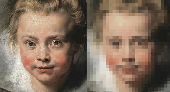
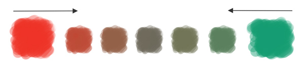
That said, the actual colours are less vivid than you might think. Here is a detail from Rubens’ portrait of his daughter, Clara Serena:


Rubens is a master of the ruddy complexion, and this strikes us as a very ruddy child indeed. But if we take a closer look at that vivid left cheek – see inset – we see that the colours are more muted than you’d think. The small second box is a colour sample from the cheek and it is certainly not bright red, more a dull terracotta. Assuming you are seeking realism, it is best to resist the temptation to use strong colours and to instead carefully build up the painting using muted hues. The vividness of Clara’s cheeks comes from the relative contrast of this muted terracotta with the even more muted colours around it.

Colour zones of the face


In light-skinned people, the face can be divided into three broad colour zones: white/yellow, red and blue-grey.


In the forehead there are relatively few surface capillaries, or blood vessels, making it a little more white or yellowish in appearance. It also tends to be slightly better lit, because it’s at the top. In the middle region of the face there are lots of capillaries full of red blood cells, giving the ears, nose and cheeks a reddish tint. And in the lower third, the chin and upper lip have a greyish or bluish tinge thanks to the hair follicles, and because it can be fractionally less well lit. This normally more affects men, but for women and children artists sometimes like to add green as a complimentary colour to bring out the lips.

Again this feature is more visible on white people than on darker people.

The three zones can be very subtle, but once you know to look for them you will spot them regularly. For example here is a pair of portraits by Rembrandt Peale:

Left: Portrait of Henry Robinson. Right: Portrait of Rosalba Peale.

You won’t find the zones in every painting, and your portrait isn’t wrong if you leave them out, but you should be aware they exist.


Creating a palette


Online you can find pre-prepared palettes – basically a set of swatches – for painting skin tones. For example here is a set made by Lauren K. Cannon for a DeviantArt tutorial series. You can save your own favourite colour combinations in Photoshop as swatch sets so they are ready to use again and you don’t have to repeat your work. 

Premade swatches can help get you started, but you can easily end up using the same set of colours for every head you paint, and it is misleading to think you can create a standard recipe for any object, given the multiple variables that influence colour. It is more rewarding to mix your own skin tones for each portrait.

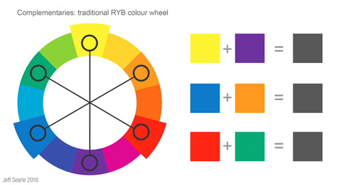
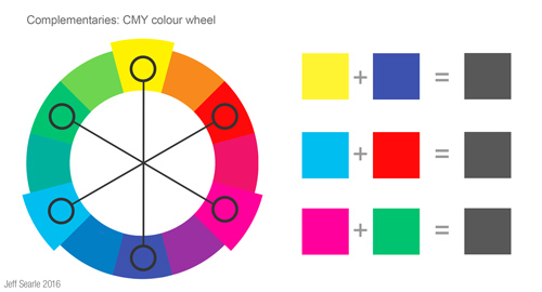
You can create skin tones using a limited starting palette of the yellow, magenta and cyan primaries plus black and white.

Begin by finding a basic skin tone. Use the yellow and magenta to create an orange. As we noted above, skin has muted colours – if a colour looks too bright you can make it more neutral by mixing in a little of its complementary colour, so add a bit of cyan to your orange to mute it. Mix in dabs of white and (very sparingly) black to get the base skin tone you’re looking for. Now create lighter and darker variations. Here’s a palette I created:


On the left are the five starting colours. The next column shows the range of five tones I mixed, with the middle one serving as the base skin tone. The third column shows three extra colours for warmth and shadows. This would be fine to kick off. While painting we could add more mixes as we went along.

When mixing the range of colours you need, ask yourself what is the hue or local colour of the subject’s skin? Nobody is literally ‘white’ or ‘black’. Is it more reddish, more yellowish? What is its value – is it lighter or darker? How saturated or intense is it – people who are florid from years of booze and outdoor work will be more vividly coloured than an invalid who’s lain in a dim room for years. You don’t have to get all these colours exactly right before you start, of course. You can keep adjusting as you go along.

Try to think beyond clichéd assumptions. For example if you are painting a white European you may instinctively assume you need to paint them a light brown. In fact they may not appear light brown at all, since the local colour of a person’s flesh is affected by the light falling upon it. If they are standing with their back to a sunset they may be in very dark shadow with a bright orange glow. If they are lying on a bright yellow pillow, part of their face may be bathed yellow with the reflected light. If they are in a dark room they will be poorly lit and thus appear dark themselves.

An intense light source can blast out local colour altogether. A strong light source creates strong highlights and shadows; a gentle, diffuse light source creates gentle highlights and shadows.

Create swatches using the Mosaic filter


When you’re thinking about what colours to use there is a sneaky technique you could try. Find a painting whose colour scheme you like. Open it in Photoshop and use Filter > Pixellate > Mosaic to reduce the image to basic blocks of colour. You can choose the degree of pixellation. Here is an example using the Rubens image:


This simple process creates a kind of swatch palette you can use as inspiration for your own paintings.

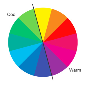
Warm and cool in portraits


In the previous article we discussed warm and cool colours. We can apply the same principles to a head in a portrait. Pairing cool light with warm shadow, or vice versa as Lucien Freud did in his painting above, creates a nice contrast and livens up the picture. Traditionally, professional portraits tend to be painted in north-lit studios, as north light is less harsh than the direct sunlight that comes from the south, and this has led to a preference for cool light with warm shadow. Rembrandt’s method was to layer cool highlights, warm light, cool half-tones and warm shadows.


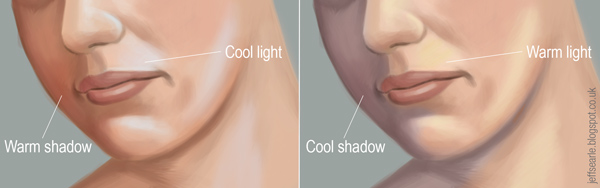
In practice, this broadly means that in a cool light you will have orange-ish shadows, and in a warm light you will have blue/purple shadows. Now, if you have a warm light source it doesn’t mean your shadows must be blue or purple, just that they should be a cooler version of the light. You have to consider the local colour of the object, i.e. the person’s head, and the temperature of the light source, and so on.

A couple of tips:

  • Colour changes on a portrait often take place where there is a change of light or plane, so consider alternating warm and cool at these places.
  • Changes of colour temperature from one stroke to another make things more interesting. Juxtaposing strong patches of warm and cool will help to make a particular bit of the painting grab the viewer’s attention.
  • Warm colours tend to jump forward a little more, so perhaps use them on nearer portions of the face and use cooler colours on portions that are farther away. Keep these shifts subtle.
  • Where skin touches skin or folds upon itself, it becomes warmer in colour. 

It’s up to you how intense you make your contrasts. Remember that by mixing colours with their complements we can create less brilliant, more neutral hues.

This interplay between light and warm is not just a technical trick – it makes a more believeable painting, and, at the risk of generalising, a more enjoyable painting. So being able to identify the temperature of colours is an essential skill.

Practicing skin-painting


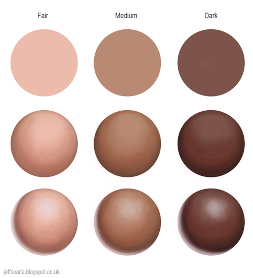
3D art has introduced the idea of the texture sphere as a standard way of presenting how to paint different materials and surfaces. The idea is to take a particular material and imagine how it would behave when painted as a sphere. Instead of simply copying what is in front of you each time, you have to understand the material well enough to make it work in three dimensions, and to repeat the process from imagination when you need it. Digital artists can use them to practice, amongst other things, human skin.

In my illustration below I show three stages in the creation of a texture sphere for skin. I’ve done studies for three complexions: fair, medium and dark.

1) Draw a circle with the elliptical marquee tool and fill it with your base skin tone, then lock the pixels of the circle. This means you can paint in the circular area only and needn’t worry about keeping the edges neat.
2) Paint in the half-tones and shadow, using a hard brush at a low opacity (say 20%). You can get a very smooth effect very quickly using a soft airbrush but skin doesn’t have a perfectly smooth texture. Remember the highlights and shadows will be less saturated than the mid-tones.
3) Finish off with highlights – not too shiny, as it’s skin – and reflected light. In my examples below I’ve used a slightly blueish light for a cool highlight, and a purplish tint for a warm shadow. Add some texture, using white dots to imply the texture of pores.


We can go further by practicing different light effects. In the examples below, I augment each complexion with veins, green light, and a cast shadow from an imaginary second object:


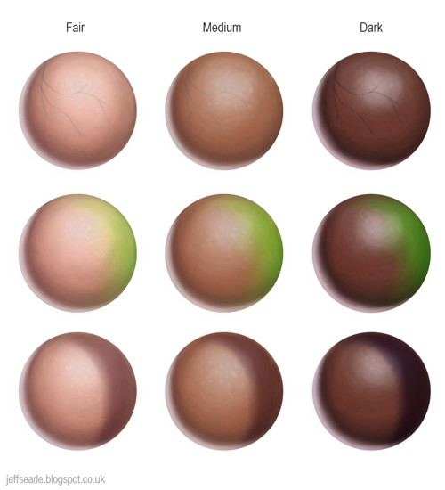
Texture spheres are a great way to practice. Make some of your own.


Subsurface scattering


Painting is all about light, and light behaves differently depending upon the material it’s striking. To paint materials realistically you need to know about these effects and be able to reproduce them. A human being is not solid, like a statue, but has a luminous outside layer.

Subsurface scattering
Photo Davepoo2014, Wikimedia Commons
When light hits a partly translucent substance, various things happen. While some of the light reflects off, some of it gets absorbed by the substance, and is scattered around as it finds its way out. This effect is known as subsurface scattering and occurs with materials like wax candles, marble, paper and skin. Though it’s not normally obvious, skin is translucent, and subsurface scattering can give it a diffuse glow. Try holding your hand up to a bright lamp or sun and you’ll see the effect.

The effect occurs when you are looking at an object with a strong light behind it – if you’re in front of it with the light behind you, you will see it lit as normal – and is particularly noticeable on small objects like fingers, noses and the fleshy parts of the ears. In ears, fingers etc we see a bright and saturated red, an effect blocked by more solid substances such as the bones in the fingers. Even if your sitter is front-lit, you might observe a red tinted edge where light travels through the skin.

Here is a quick digital study I made of subsurface scattering affecting the ear:


And here is my attempt at a subsurface scattering texture sphere:


Note that black people’s skin absorbs more light thanks to its higher melanin content, so more of the light coming off it is reflected rather than scattered.

The classic oil painters built up their flesh in layers, and the paint, being translucent, would have a convincing fleshiness to it through several colours working at once. How can we reproduce this luminosity? As the light bounces through the shadow areas it makes them warmer and more saturated, particularly at the core shadow, so on a new layer try adding red-orange throughout the figure at the edge of the core shadow and adjust it using blending modes.

Edges


Edges mark the ends and beginnings of forms, changes of plane on the same form, or changes of colour or value. The selective defining of edges is one of the ways an artist can guide the viewer’s eye in a picture.

It is natural for a beginner to assume that all the edges in a realist drawing or painting should be sharp, because when we look at an object its edges appear in focus. However, edges that are on the periphery of our vision, or are moving, or are further away, are softer and can even be impossible to see at all. Careful variation of edges therefore is important to the illusion of realism and three-dimensionality, and also gives us some textural contrast. A painting with all hard edges will look rigid and full of cut-out shapes.

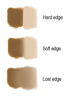
There is a scale of edges running from hardest to softest. Not everyone categorises them in exactly the same way, but essentially edges can be hard, soft or lost.

  • Hard edges are clear, crisp strokes placed side by side. They create contrast and therefore attract attention. Use your hardest edges to help draw the viewer’s eye to centres of interest. Some artists additionally talk of firm edges which are a bit less defined.
  • A soft edge is a slight blur between two forms. Objects only become sharp when we focus on them, so in general you should keep your edges soft. This is how the old masters painted. Soft edges let the eye roam unhindered.
  • A lost edge occurs when you can’t tell where one thing ends and the other begins. Perhaps the two forms are very fuzzy, or have very similar tonal values. Typically you might find it where dark hair disappears into a dark background. Lost edges are a good way to loosen up a picture. 


Here is an illustration of hard, soft and lost edges as used by Rembrandt:


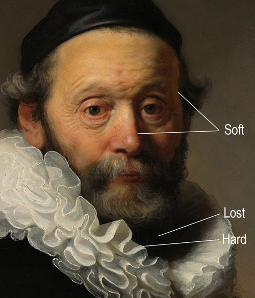
Rembrandt: Portrait of Johannes Wtenbogaert (detail)

Of course much depends upon the context of the picture. If a hard-edged object sits against another of very similar colour and value, the edge will no longer jump out and may even become effectively ‘lost’.

Use your edges in combination with other aspects of a picture, such as contrasts of hue and value, to lead the viewer’s eye around the painting. They will help you create a sense of space, atmosphere and realism. We may lay out a few rules of thumb:

  • The brighter the light, the harder the edge; the dimmer the light, the softer the edge. 
  • The nearer the object, the harder the edge; the farther the object, the softer the edge.
  • Harder on hard, smooth forms; softer on soft, textured ones. 
  • Harder on motionless forms; softer on moving ones. 
  • Harder on the centre of interest, soft elsewhere.

You don’t need to define every edge fully, because the viewer will understand the forms and supply missing information from their imagination. This is most obvious with lost edges, but generally, you can establish part of an edge then let the rest dissolve away if you wish, because the viewer’s mind will assume the rest.

I think the beauty of soft edges comes from this shortage of information. A hard, clear form feels done and dusted, whereas the ambivalence within a soft edge allows the imagination to enter the work... to let the viewer supply what isn’t quite said.

Distance


Near objects are hard-edged and far objects soft-edged, so you can manipulate edges to communicate their relative distance from the viewer. The broad movement of edges into a painting with any depth of field, such as a landscape, will normally be from hard to soft. This doesn’t mean that everything near must be hard-edged and everything distant must be soft-edged. You just need to be aware of the tendency and to manage the way objects advance and recede so that they work together to produce the effects you want.

The example below illustrates a few principles at once. See how John Singer Sargent modulates the edge of Mrs Boit’s seat.


John Singer Sargent: Mrs. Edward Darley Boit (detail)

From a hard edge with strong contrast at the start (A) it continues into a soft edge with low contrast at (B). It almost becomes a lost edge at that point. Keeping the line as well-lit and crisp as it is at (A) would interfere with our understanding that it disappears behind the seated figure. I expect Sargent also didn’t want anything distracting us from Mrs Boit’s head and neck. The crisp line created at (A) points towards her face, a directional cue that would be spoilt if our eye was led downward again further along that edge.

The main point to take away is that, as the painter Stapleton Kearns puts it, edges need to be designed, not observed. And if your artistic intuition suggests handling an edge in a certain way, it may be best to go with it, even if it breaks one of the ‘rules’.

Making it ‘painterly’


Sargent’s brushstrokes cut a painterly dash
in his portrait of Gabriel Fauré.

Edges lead us into a related topic, namely how rough or smooth a finish you prefer. This is a matter of taste, but personally I prefer a ‘painterly’ texture. There is no mystery to this. It simply means we apply the paint in a more or less loose manner, allowing the brush strokes to show and create texture.

This is less of a challenge for traditional media than for digital painting. I don't necessarily advocate trying to make digital art imitate traditional media – the curmudgeon in me thinks if you really want an ‘oil paints effect’, use oil paints. But the pixel-precise control and mechanical tools available in software can make paintings look artificial and plasticky.

I think a painterly texture contributes to a sense of animation. A lively person moves around and is a bit blurry, whereas to closely peruse the details of a person’s face they have to hold still. Someone painted to a ‘perfect’ level of polish and focus can easily look frozen, whatever their facial expression.

Here are a couple of ideas:

  • Edges are very important. Let strokes of colour sit side by side with minimal blending and smoothing.
  • Be prepared to leave parts of the painting very rough and loosely finished. 
  • Avoid mechanical effects like computer-generated gradients or airbrushes.  
  • Don’t overwork the painting. 
  • Start with big loose strokes, then zoom in and create detail in key areas with smaller loose strokes. 

A couple of regular, versatile brushes are mostly all you need. Some artists prefer Corel Painter for its artsy brush tools, and custom brushes can make nice effects. There’s no harm in experimenting with your brush settings to make them more unpredictable or textured, and a customised Smudge tool (not the default smeary one) can give texture to your edges. Photoshop’s answer to reproducing paint effects is the Mixer Brush, which lets you blend colours on the brush with colours in the painting. 

But painterly texture is not primarily about what brush you use, so much as how you use it, and your understanding of light, colour and atmosphere. Only experimentation and experience will get you where you want to go, and don’t be discouraged if it takes a long time, even years, to figure it out. Do lots of studies aimed at solving specific challenges.

Skin texture


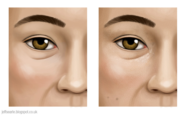
If you look at human skin closely, it is not smooth like porcelain but has a rough texture created by pores, moles and hair follicles. A bit of texture adds realism and helps you avoid the plastic look that overly ‘perfect’ digital skin can have. While most of your texture should come from using a painterly approach to painting the head, you can also add some separately as a final polish.

Digital artists sometimes use custom texture brushes for this. A simple method is to dab a few speckles of varying opacity onto a square, make it a bit blurry, then save it as a brush in Edit > Define Brush Preset. Apply some scattering, say 120%, and an angle jitter for variety.


Clever brushes can be seductive. Really all you need is a basic round brush, at small size, and use it to dab or scribble on a new layer so you can adjust the opacity etc to complement the skin. Keep it at a very low opacity.

In the before-and-after below I applied a custom texture brush to the right-hand image then scribbled on top for some extra effect. 


Many digital artists seem to get obsessed with fine detail. Unless you’re a hyper-realist, I don’t recommend you get carried away with trying to reproduce every hair and every pore, as I don’t believe it contributes to the feeling of the painting. A broad sense of texture will do perfectly well, and many superb paintings past and present don’t trouble with it at all. The great oil painters didn’t see any point in painting individual pores and hairs and you don’t need to either. The whole point of painting someone is to communicate something emotional, about their and/or the artist’s state of mind. To spend hours on relatively insignificant details is to misdirect your energies in my opinion.

A last word


Please bear one thing in mind. Techniques like the ones above can sound exciting to beginners, like ‘secrets’ that will help them paint like professionals. Theory is important, but artists shouldn’t let it stop them creating images the way they want to. For example don’t feel you have to rush off and remake your last portrait because it doesn’t include ‘colour zones of the face’. Even with broadly accepted ideas like colour temperature, artists disagree on where to draw the line between warm and cool (greens and purples can be contentious) or simply respond to them in different ways. The rule is not to follow a formula but to paint what you see – more or less. And if you don't like what you see, well, paint whatever you want!


Friday 9 September 2016

Colour relationships

The colour wheel


If you take the visible spectrum and wrap it around so the ends meet up, you get a pretty disc.


In the spectrum, which is linear, red and blue don’t meet up and merge – they appear at opposite ends and have very different wavelengths. To complete our circular scheme we add magenta, a non-spectral mixture of red and blue/violet that forms a natural bridge.

If we then simplify the range of hues into blocks on a ring, you get a ‘colour wheel’ or ‘hue circle’. This is long-established, familiar way of organising colour and showing its relationships. For consistency, in all illustrations I’ll put yellow at the top and keep the reds on the right.


People have been diagramming colour since Aristotle, but the wheel form was pioneered by Isaac Newton, and it has taken various forms over the centuries. The one above is a traditional wheel. There are problems with it, but first let’s outline how we got to it.

Components of the traditional colour wheel


The purpose of the colour wheel is to visually represent colour theory. You begin building it by placing the three primary colours equidistant to each other on the circle. For painters, the traditional primary colours are red, yellow and blue (we’ll call this RYB). These are allegedly the only colours that can’t be made by mixing any other colours together, and from which all the other colours can be mixed. Let’s make their blocks a bit bigger to emphasise them:


When you mix any two of the primaries, you get three new colours known as secondary colours.

  • Yellow and red make orange.
  • Red and blue make violet/purple.
  • Blue and yellow make green.

We use these to fill the gaps between the primaries:


When you mix each primary with its nearest secondary, you get six further tertiary colours.

  • Yellow and orange make yellow-orange.
  • Red and orange make red-orange.
  • Red and violet make red-violet.
  • Blue and violet make blue-violet.
  • Blue and green make blue-green.
  • Yellow and green make yellow-green.

We use the tertiary colours to fill the remaining gaps in the wheel. These add up to twelve basic colours with which you can mix countless others.


Here is our colour wheel again with all those relationships labelled:


By diagramming the relationships between colours, the wheel helps us to devise colour schemes. The closer together colours are on the wheel, the more similar and harmonious they are, since each hue contains some of the hues next to it. Colours that are more separated are less closely related. Colours that are opposite each other on the wheel form the strongest colour contrasts.

All looks pretty neat, right?

Problems with the colour wheel


The RYB primaries, and the colour wheel based upon them, are still taught to this day. However this approach is based upon an understanding of colour that became outdated in the late nineteenth century.

The RYB colour wheel is a legacy of the early days of colour research, when artists didn’t have the range of pigments available to us and the different sorts of colour relationships (e.g. psychology, light and pigment) weren’t understood. During the nineteenth century, the discovery of opponent pairs and the differences between mixing light and mixing pigments revealed that a single colour wheel couldn’t represent the relationships correctly for all cases. As David Briggs puts it:

The historical primaries, Y, R and B are the three names that we generally applied to our best primary colourant hues when we first discovered them, before it occurred to us that the hues we mentally experience as pure and primary might not be the same as the optimal primary hues for colourant mixing.
Dimensions of Colour – The historical primaries: yellow, red and blue

A colour wheel needs to represent either additive or subtractive mixing: either the world of light or the world of paints. For painting, the optimal subtractive primaries that offer the widest gamut are actually cyan, magenta and yellow, a reality recognised by the print industry long ago. RYB lives on amongst painters because of outdated teaching and sheer habit – we’re accustomed since pre-school to thinking of red and blue, rather than magenta and cyan. RYB can be seen as the psychological primaries with green missing, or as an inaccurate approximation of the subtractive primaries from a time when there were no satisfactory cyan and magenta paints. They have never, as painters will tell you, been able to mix ‘all other colours’ satisfactorily, especially greens and purples. Most artists who use RYB primaries ignore the theory when necessary and rely instead on their practical paint-mixing experience to get the palette they want. Nowadays there’s no good reason to persist with RYB.

The CMY wheel


We can improve on the traditional wheel if we take CMY as our three equally spaced primaries. Red, green and blue become our secondaries and we fill the gaps with intermediate mixtures, giving us the CMY-based colour wheel:


We may alternatively call this the CMY-RGB wheel, or follow the artist James Gurney in calling it the ‘Yurmby’ wheel, roughly after the letters of the colours going clockwise: YRMBCG. Gurney has produced a version which includes declining intensities down to grey, which you can see on his blog. This has the advantage of incorporating two of the three dimensions of colour (hue and chroma) instead of just one (hue).

When we compare the results from RYB and CMY primaries we notice that the CMY-derived colours are more brilliant, especially in the greens and purples. Below are two examples I painted in Photoshop:


This proves that red is not a primary colour, because we can mix it using yellow and magenta, and that blue isn’t one either, because we can mix it using cyan and magenta. The CMY wheel is still somewhat arbitrary, for example because the CMY hues are spaced evenly at 120° for the sake of symmetry not because it’s scientifically ‘correct’. But it has the advantage of evening up the spacing of the colours – the traditional wheel gives disproportionate space to varieties of orange.

Admittedly even today there’s an issue with getting really good paints for cyan and magenta, though the options are much better than in the past. The best recommendations for the CMY primaries seem to be Lemon Yellow, Quinacridone Magenta and Pthalocyanine Blue.

You could think of the CMY wheel as a set of six primary colours. When we mix colours on opposite sides of the wheel they produce grey. This desaturating tendency also affects colours less far removed, meaning that the secondary colours we mix from two primaries will suffer a certain loss of saturation. A sensible response is to choose primary paints for the secondaries as well, giving us a six-colour palette. Of all palettes based upon a limited set of primaries, this is probably the best. If you think such a palette is crowded or expensive, keep to the three CMY primaries.

Primary colours in paint-mixing


Having said all this, don’t get hung up on the intricacies of colour wheels and their ‘colour primaries’. As Goethe said, “theory is grey, my friend, but the tree of life is forever green”. While a limited palette can be both instructive and satisfying, not to mention less expensive, there is no rule that you may only paint using three primaries plus white and black. If you are using CMY primaries but want to include burnt umber or any other paint in your palette, e.g. to save mixing a brown when you can get it straight from a tube, then include it. You are not an inferior artist for doing so. Similarly, the three CMY primaries offer a wider, brighter gamut than the RYB primaries, but if you have always used RYB and are getting the results you want, you’re welcome to stick with it.

In fact you can use palettes with no primary colours at all. Primaries can inform you about how colours are made and help you make decisions, but they have limitations. No three primaries, whatever they are, can mix all visible colours. Artists use them because 1) it is traditional to do so, 2) they offer a limited palette within which all the colours have a certain relationship, and 3) it’s useful to be able to define colours in terms of precise proportions of one primary to another, in the same way that universal Pantone swatches are useful to printers.

The print industry uses CMY (plus K) as a standard because keeping to just three primaries is more cost-effective and those are the three that allow the widest gamut. Six-colour printing for example offers a bigger range of crisper colours, but is more expensive. If printers could use six primaries as a standard for little or no extra cost, they probably would.

Incidentally people sometimes claim that CMY is for printing, not painting. This is incorrect. The CMY system works equally for both paints and inks.

Colour wheels and their limitations


Colour wheels too have their limitations. The point of a wheel is to organise colour into relationships. They impose symmetry and order upon a messy subject, but distort it in the process. No wheel is entirely reliable as a guide to mixing paints. Additive mixing can be conceptual and geometrically exact, but the forced geometry of a colour wheel misrepresents the realities of subtractive mixing, which has to take into account the irregularities that arise when using physical substances with different chemical makeups. When we combine substances that reflect and absorb light differently, we don’t always get the results theory leads us to expect (Bruce MacEvoy calls this substance uncertainty.) Practical experience is better.

Artists also have to deal with the imbalance in available pigments: there are lots more paints in the yellow-orange-red range than there are on the blue-green side of the wheel, and the historical dominance of the misleading RYB system means there few paints that even have the names of cyan and magenta, or you get paints like Cerulean ‘Blue’ which is actually cyan.

The CIE 1931 xy chromaticity space
Another limitation of colour wheels is that colour has three dimensions – hue, value and chroma – whereas most wheels only chart hues, and thus leave out a mass of important information. (We’ve mentioned Gurney’s Yurmby wheel as an exception; Albert Munsell’s three-dimensional system is another.) And the hues picked for the wheel tend to be a bit arbitrary. Precisely which hues are meant by ‘red’, ‘yellow’, ‘blue’ etc varies a great deal. Colour scientists prefer the breadth and precision of complex chromaticity diagrams that chart colour spaces (right). We don’t have to follow their example, just recognise that by their nature all colour wheels, including the CMY wheel I’ve recommended, are symbolic constructs. None is objectively the ‘correct’ one, though some can justify themselves better than others.

Complementary colours


Complementary colours are hues placed opposite each other on the colour wheel, making them balanced or antagonistic depending on your point of view. These pairs are especially high contrast, each hue making the other seem more bright and intense when placed side by side.

In the additive mixing of light, the primary colours are RGB. The secondary (i.e. made from two primaries) colours are cyan, magenta and yellow. These secondaries are the complements of the primary colours opposite.


Why do we call them ‘complementary’? In additive mixing, the three primaries combine to create white. It follows that if we add a primary colour to its complement, which is a mixture of the other two primaries, they will combine to give us the full triad. Cyan for example is a mixture of blue and green; when we add red they complete or ‘complement’ each other, to make white.

I’m discussing complements in terms of primaries because it’s simple and those are the pairs that are constantly evoked, but any colour positioned directly opposite another on a colour wheel is a complement.  

What about the subtractive mixing used in painting? These combine to create grey or black. On the traditional colour wheel below I’ve picked out the main three pairings: yellow and violet, blue and orange, red and green.


What if we’re using a CMY wheel? Here the complement pairs aren’t yellow/violet, blue/orange, red/green. They’re the same as the additive complementaries: yellow/blue, cyan/red, magenta/green:


Neatly, the primary colours of light are the complements of the primary colours of paint and ink, and vice versa. Here again we see how the colours complete or ‘complement’ each other by adding up to the three primaries. Two examples. On the RYB wheel: in the orange/blue pairing, orange is made of red and yellow, plus the blue gives us RYB. On the CMY wheel: in the green/magenta pairing, green is made of yellow and cyan, plus magenta gives us CMY.

On other wheels – such as Munsell’s ten-hue wheel, or a wheel based upon the four psychological primaries and opponent hues (red, green, yellow and blue) – you’ll get different pairs again. The difference between these subtractive systems can be puzzling. Art teaching routinely asserts that the complement of red is green, not cyan. How can there be different sets of complementary colours? Which is right?

Visual vs mixing complements


There are two kinds of complementary colours. Visual complements are based upon additive mixing and tell us which colours create the most powerful visual contrast. Mixing complements are based upon subtractive pigment mixing, whereby we can mix a colour with its complement to create a nice range of muted or neutral hues all the way to grey. As it turns out, the optimal complements in these two cases are not the same. The best pigment complement for mixing yellow down to neutral and grey hues is violet, but the best complement for creating a striking visual contrast in a picture is blue.


The reason why they differ lies in the complexities of mixing pigment substances together. By the way, these colour contrasts work regardless of whether it’s on a screen or on canvas. It’s still yellow/violet or yellow/blue either way.

The traditional complements roughly hold true for pigment-mixing purposes. However, when making colour choices for how their artwork looks, artists should put the visual complements first. Our colour decisions should centre around what a viewer will experience when they see the finished artwork, not on the process the artist used to mix greys.

This leads us to a conclusion that can be rather startling the first time you realise it. The traditional complementary pairings that are taken for granted by artists, designers and others across the world are misleading. Red isn’t really the complement of green: add red and green light and you get yellow, not white. Modern colour theory tells us the complement of red is not green, it’s cyan. The complement of yellow is not violet, it’s blue. The complement of green is not red, it’s magenta. We are so used to the ubiquitous traditional pairs that most sources simply regurgitate them.

We can test the true complements by studying after-images. Try it yourself using the flag below (click to enlarge the image if you like). Stare at the black star in the flag on the left for half a minute, without looking elsewhere. Then switch your gaze to the white space on the right. Don’t forget to blink.


What is happening is your eyes are being desensitised to the three colours in the flag till they respond instead to the visual complements of those colours. Cyan becomes red. Yellow becomes blue. (You can try more after-images here.) Visual colour experiences follow the additive complements, not the paint-mixing ones. This is why the filters in 3D glasses for example are red and cyan.

There are various ways of approaching colour: psychological response and pigments and optics don’t all work the same way. Thus, like most colour theory, complementary colours seem simple but get confusing when you study them properly. Add to that some outdated but persistent ideas, and imprecision over the exact hues being used, and you find yourself picking through a minefield.

Is it ‘wrong’ to use the traditional complements? Well, they’re not true complements by the modern definition. The highly respected colour theorist David Briggs, whose Dimensions of Colour is a must-read, is quite stern about them:

The orange/blue, red/green and violet/yellow complementaries are part of a very simplistic and antiquated approach to colour theory that was revived in the 1970s when the teaching of the technical elements in art education reached its lowest point. The sooner they are dropped entirely the better!
Comment on a ConceptArt.org forum thread, April 2014

They are correct within the (flawed) framework of the RYB colour system, and artists have used them for centuries without provoking a crisis in art – many renowned paintings rely on them for their effects. They still produce striking contrasts, and they aren’t a million miles away from the correct visual complements. The CMY wheel supports blue/orange complements too, so there is familiarity in that; the yellow-green/violet pair isn’t so far from the traditional yellow/violet, and the red/cyan pair is more familiar than it looks, since cyan is greenish by nature. So although today’s artists are best advised to use the actual visual complements, in my view we shouldn’t get hung up on the traditional ones being wrong.

Let’s have a closer look at what we can do with visual and mixing complements.

Visual complements


We can put complements side by side so that each makes the other more vivid. Many artworks make powerful use of such a colour scheme (though the effect is not necessarily pleasant). Van Gogh offers lots of examples:


Van Gogh: The Night Café at Arles, 1888.

This sort of colour scheme is vivid, even fatiguing, so artists will sometimes emphasise one colour more, and use the other one in smaller amounts or with lower saturation. Rather than using complements for an entire painting you can use them within a more muted colour scheme, exploiting the contrast to draw the viewer’s attention to a particular area. In the Van Gogh above, there is as much dull yellow as there is red or green.

Mixing complements


Mixing complements of course are for when we mix paints together. When we mix additive complements they make white. In subtractive mixing, it follows that complements combine to form grey or black. Technically they should always add up to black, but generally do not because of complications in the mixing of actual substances instead of ‘ideal’ colours.

Mixing a paint with its complement will make grey. Don’t assume that a half-and-half mixture will do. The exact measures you need depend on the pigments. Of course you could just mix black and white if you want grey, but with complements you can choose a balance between the two: adding only a little of a complement will mute the base colour, offering a nice range of neutral hues (it’s churlish to call them 'mud’).


The light in shadow areas typically takes on the complementary colour of the main light, so you can take advantage of this by mixing complements to paint shadows, judging whether you’d like them warmer or cooler. 

Of course, when using physical paints we have to consider the practical realities of substance uncertainty: the mixing of pigments to grey can be inconsistent. Translating the perfect complementary pairs we can create conceptually to specific paints can be problematic. Exactly which yellow, from the paints available, is complementary to exactly which violet? The relationship can only ever be approximate, and in practice, individual paints can work as mixing complements for several paints on the other side of the wheel. The best thing is to get your paints out and learn what works through experiment.

If you’re painting digitally then you are spared these paint-mixing issues. You can easily find a colour’s complement in your colour picker by amending the H (for ‘hue’) value by 180°, i.e. the exact opposite side on the hue circle. In Photoshop it’s presented as a hue strip but it works either way.


Simultaneous contrast


When we put two colours side by side, their relationship changes the way we perceive them. This is called simultaneous contrast, of which complementary colours are the strongest example. Simultaneous contrast effects occur because our colour perception is not a scientific instrument but is constantly readjusting and making comparisons. It seems to work pretty well, but it can play tricks on us too. Take a look at this illustration:


Image: Dodek (Wikimedia Commons). 

The grey bar in the centre appears to get progressively darker from left to right; in fact the bar is the same colour throughout. The effect is an illusion induced by the gradient in the background. When we see dark and light colours next to each other, our brain makes the darks seem darker and the lights seem lighter.

The inner box on the left looks darker than the one on the right.

In simultaneous contrast the appearance of a colour moves away from the surrounding colour in some fashion. Any of the three dimensions of colour – hue, value and chroma – can be affected.

  • Juxtapose a colour with a lighter colour and it will appear darker, and vice versa.
  • Juxtapose a warm colour with a cool colour and it will look warmer, and vice versa.
  • Juxtapose a colour with a less saturated colour and it will appear more saturated, and vice versa.
  • Juxtapose a colour with a solid hue and it will subtly shift its appearance towards the complementary of that colour. 

These effects teach us that we shouldn’t only think of individual hues; we must take the relationships between colours seriously too.

Split-complementary colour


Instead of choosing the base colour’s complement, we can use the two colours on either side of the complement instead. This is known as a split-complementary colour scheme:


We still get contrast, but within a scheme that is less intense and less potentially jarring.

Analogous colour


Analogous colours – usually three or four hues – sit next to each other on the colour wheel. Their closeness means they share similar colour elements, helping them to work harmoniously together.


When creating an analogous colour scheme, we normally choose one dominant colour and recruit a couple more as support. Mixing the supporting colours with the main one, along with black, white and grey, gives us a subtle, low-contrast range of colours pleasing to the eye.

Colour temperature: warm and cool


Colour ‘temperature’ is an important kind of colour contrast that entered art theory in the 18th century. We can divide the colour spectrum into two broad camps: the warm hues of yellow, red and orange and the cool hues of blue, purple and green. Warm hues are meant to be more exciting and engaging, cool hues more calm and receding (think of the bluish cast of distant mountains).


The point is to manipulate the contrast to excite the viewer’s eye, perhaps only in a subtle way, but enough to make the image more interesting and to hold and direct the viewer’s attention. As opposites on the colour wheel, complementary pairs always have one warm and one cool colour.

Artists are welcome to argue about where the dividing line should be drawn. ‘Warm’ and ‘cool’ are not cast-iron concepts, with a precise boundary. They are psychological and open to interpretation. We can probably agree that yellow, orange and red are warm, and that blue and blue-green are cool.

We can use warm and cool colours to create contrast by putting them side by side. For example, you can use this effect to enhance the sense of depth in your picture. If you put an object painted in warm colours (such as a person or a pair of oranges) in front of a background of cool colours (such as a landscape or a room), the warm object will jump out more vividly. In Café Terrace at Night (1888), Van Gogh exploits the contrast to make the café look especially lively and inviting:


Is purple warm, because it contains red? Or is it cool, because it contains blue? Actually it can be either, depending on the context: contrast it with an orange hue and it will go backward, contrast it with a blue and it will come forward. Similarly, individual colours have warmer and cooler versions: we may have a cooler red (leaning towards blue) or a warmer red (leaning towards yellow). In a bluish landscape a patch of green might be the warmest colour in the picture. It’s not that some colours ‘are’ warm and others ‘are’ cool. It’s more useful to say that colours tend to be warmer or cooler relative to other colours in the picture.

You can make a warm colour cooler by shifting its hue closer towards the cool half of the spectrum, and vice versa:


For a different kind of mood you can use colours entirely from the ‘warm’ or ‘cool’ halves of the spectrum in both foreground and background. You could then choose warmer or cooler versions of those colours for contrast and depth.

The temperature of a colour depends on your main light source. A common rule of thumb is to pair warm light with cool shadow, or cool light with warm shadow. Light doesn’t necessarily obey this simple formula every time in real life, but harnessing the contrasts of complementary colours creates a vivid painting. Direct sunlight and incandescent lighting tend to be warm, and thus pair effectively with cooler shadows. Outdoor shadows tend to be bluish because they pick up the ambient blue of the sky rather than the white-yellow glare of the sun that is lighting the form.

What next


When we paint, what matters is the relationships of the colours in the painting. Understanding these dynamics will help you make your colour choices. From an artist’s perspective, the point of theory is to help us paint better. Over the last two articles we’ve established that colour is a complicated matter, further confused by a lot of misconceptions. The best approach for artists is to complement theory with the lived experience of colour.

As an exercise try painting colour wheels, as you will learn much more about relationships and mixing behaviours than you will from looking at a diagram. Begin with the primaries, then add the secondaries, then add the tertiaries. The way to learn colour mixing is to mix real colours, in the medium or media appropriate to your work.