What is colour?
Light, without which we can’t see anything, is a form of electromagnetic radiation flowing from the sun or other source and is made of a range of wavelengths. The number of waves passing a given point each second is a wave’s frequency. Wavelength and frequency aren’t the same thing, but what matters is that we see these different wavelengths/frequencies as different colours.
The longest wavelength of light we can see is red and the shortest is violet – all wavelengths together form what we call the visible spectrum:

This range of colours is continuous, but we break it up with our familiar and somewhat arbitrary colour labels such as red, green, orange and so on.
These visible light waves are the only electromagnetic waves the human eye can see. There are many other forms of electromagnetic radiation, such as X-rays, ultra-violet and infra-red, that don’t enter into the range human vision can detect, just as there are sounds too high or too low for us to hear. We can however feel infra-red as heat, or experience the burning of our skin thanks to ultra-violet.
Rays from the sun or lamps are known as ‘white light’ but contain all the colours of the rainbow. This goes against our intuition, because white seems like an absence of colour, and when we mix up all our paints we don’t get white, we get mud. Nonetheless, white light is in fact the sum of all the wavelengths of light. This was demonstrated by Isaac Newton when he observed that a prism, via refraction, bends rays of light by different amounts, splitting up white light according to the different wavelengths within it. We see these differences as a range of colours, namely the coloured band of the spectrum. (There's a nice video about it here.)

These wavelengths don’t really have colours at all. Colours are not physical properties residing in the spectrum, any more than the sounds we hear are physical properties of vibrating air. Colour is a sensation created by our sense of vision, nervous system and brain to help us interpret the light emitted or reflected from the physical world around us. Colour isn’t an illusion, either – it’s an interpretation of real data, namely the variable wavelengths of visible light.
Of course, the way we perceive light and colours is affected by many variables, such as the position of the sun, atmospheric effects, north vs south light, and so on.
Non-spectral colour
A colour evoked by a single wavelength (or very narrow range of wavelengths) in the visible spectrum is known as spectral or monochromatic colour. Perhaps surprisingly, it is also possible to perceive colours that do not appear in the spectrum. White, black and shades of grey are colours, as are magenta, brown and olive-green, but you won’t see any of these in a rainbow, or in the spectrum thrown up by a prism.
Red, orange, yellow, green, blue, violet. No magenta.
Photo: E Gregory (Flickr).
These non-spectral colours are produced not from a single wavelength but from a combination of wavelengths. Sometimes people claim that colours like magenta ‘don’t really exist’, but they are forgetting that colour is a sensation created by our biology from light data, not a property of light. White light isn’t made of a single wavelength either, and isn't part of the spectrum. In fact, we rarely see monochromatic colour in our daily lives, because the world is a complex environment of tints and shades and reflected colours.
Another consideration is that the spectrum is composed only of hues. There are other elements of colour, namely value (how light or dark it is) and saturation (how intense it is), that introduce further variation beyond what appears in the spectrum. Thus brown may be thought of as a dark, less intense yellow or orange. In short, there is more to colour than just the visible spectrum.
Why objects have colour
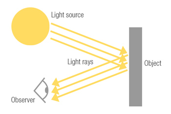
Our experience of the coloured world is of light reflecting off surfaces. White light contains every colour but we don't see all objects as white. This is because objects’ physical properties absorb and reflect different wavelengths of light.
When the sun shines on a lime, for example, the reason the lime looks green is because it’s made of stuff that reflects green light more than it reflects the other colours, which get absorbed and transformed into heat.

A lemon reflects yellow light; white objects reflect all colours; black objects reflect little or no colour and instead absorb all wavelengths of light (and therefore heat). At night the level of light is too low for colour to be reflected off objects, which is why everything looks black. More accurately, of course, objects don’t normally reflect a single, pure colour but a range: the lime will mostly reflect green but will also reflect some of the neighbouring yellowish and bluish hues for example.
Again, objects have no colour in themselves; when light shines upon them they appear to have colour to an observer. If the light itself is coloured, that affects how we see the object. In red light the lime will appear black, because the red light gets absorbed and there is no green light to reflect.
The colour of an object also depends upon the perceiver. Humans have good all-round colour vision, though a minority are colourblind. Other animals often see more or fewer colours than we do.
The three dimensions of colour
There are three aspects of colour, first classified by the art teacher Albert Munsell: hue, value and chroma. Artists need to be aware of all three, and to ‘think consciously of their colouring activities as maneuvering through a three-dimensional colour space’ (David Briggs).
Hue
Hue is the name of a colour. When we say something is red, green, blue etc we are describing its hue. Below is a digital painting I made of an apple.

These apples are identical except for their hue: one is red, one is green. We can also name variations of each hue, such as yellow-green or blue-green.
When we talk about the ‘colours’ of the visible spectrum, we are really only talking of hue, specifically the range of hues visible as monochromatic light. As I mentioned above, there are hues that don’t appear on the spectrum.
Value
Value, also known as luminosity or lightness, refers to the lightness or darkness of a colour ranging from black to white. Below, the apple on the left combines hue, value and chroma. The greyscale one on the right shows only value. It demonstrates that value can exist without hue.

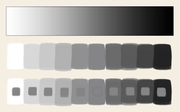
Value measures the amount of light being reflected from an object. The terms tint and shade refer to lighter and darker versions of a colour; in paint-mixing, a tint is a mixture with white, a shade is a mixture with black. Getting the values correct is arguably the most important consideration when dealing with colour, as poor handling of light and dark is more noticeable than a hue being a bit off.
Below I’ve made a scale of value of one colour (red) plus a greyscale version:

Chroma
Chroma is also known as intensity or saturation. It is a measure of how strong the colour is in relation to a plain grey of the same value. Here is my apple again, but with varieties of intensity.

The leftmost apple is the most intense. The middle one is less intense but still looks realistic. The rightmost is starting to look grey.
Although ‘chroma’ and ‘saturation’ are often used as synonyms, I should point out that strictly they are different, though related. Whereas chroma measures the intensity or purity of a hue, saturation is the amount of colour in relation to brightness. This gets technical: you can look it up if you’re interested.
People sometimes confuse chroma with value; a scale like the one below helps show the difference. All the blocks are the same value, i.e. they don’t get lighter or darker, but they decrease in saturation in steps of 10% until the red has turned grey:

Nonetheless, chroma does have a relationship with value. With maximum light we get white, and with minimum light we get black, leaving no scope in either case for chroma. This is why chroma must be considered as it relates to grey. As we move away from the extremes of white or black the chroma gradually increases until it reaches a maximum intensity, known as peak chroma, that varies depending on the hue. Yellow peaks at a light value, red at a medium value, blue at a dark value.
A colour in shadow cannot have the same intensity as a colour that is better lit, and bright light can wash out intensity too. For this reason the most intense colours are usually found in the mid-tones of an image, while the lights and shadows are less saturated.
Mapping three-dimensional colour
A good colour model tries to map all three relationships. The hues are marked around the rim of a circle, decreasing in chroma towards the centre, while the vertical marks lighter or darker versions of each hue i.e. changes in value.

An example of such a model is the system devised by Albert Munsell in the early twentieth century. Another is the HSV a.k.a. HSB (H for ‘hue’, S for ‘saturation’, V for ‘value’ / B for ‘brightness’) colour space used for colour selection tools by digital software like Photoshop or Painter. Colour pickers represent the three dimensions of colour two-dimensionally with a hue circle or strip plus an area for adjusting value and intensity:
In digital painting software, we can pick colours using RGB values, but they’re not the most intuitive terms for a painter, for whom HSB values relating to hue, value and chroma form a more appropriate language for colour selection.
Primary colours of light
If white light can be split into the visible spectrum, the reverse is also true: the coloured rays combine to make white when they are mixed together again.
Most visible colours can be made by mixing just three: red, green and blue (RGB). We call these primary colours. If we look very closely at the pixels on a TV screen or computer monitor, we see that even white is made of these three colours, and that yellow for example is made of red and green.

Trichromacy
RGB technology flows from the way we sense light. There are three primaries because the six million colour-sensitive cells in our retinas known as cones come in three types: L, M and S, responding to long, middle and short wavelengths respectively. (There are also 120 million rods which primarily detect light and dark and are important to night vision.) Our eyes convert light energy into chemical signals and the brain creates colour sensations based upon differences in the responses between the three types of cone.
Why are there three cone types? We can’t have a separate receptor in our eye for each one of millions of individual colours. Instead our biology has settled on the more efficient solution of three receptor types sensitive to different parts of the spectrum, whose outputs are combined to create a broad range. There’s no cosmic law that says there must be three types – it’s just a solution nature came up with.
This use of three ‘channels’ to enable animals to interpret a full spectrum of colour is called trichromacy, a theory pioneered by the likes of Young, Maxwell and Helmholtz. A minority of people experience colour blindness or dichromacy, having only two receptors instead of three and therefore a more limited range of colour vision. There is even a very small number of tetrachromats who have four receptors.
While sensitive to a range of wavelengths of light, each cone type responds to a certain range more than the others. It is sometimes thought that each cone type ‘detects’ red, green and blue respectively. In reality the cones’ ranges of sensitivity overlap. Individual cone types do not detect individual colours or wavelengths – instead, a colour is created by comparing all their responses.
The illustration below shows the range of sensitivity of the three cone types superimposed upon the spectrum. L and M cones are sensitive to all wavelengths whereas the range covered by S cones is narrower. Their ranges peak at green, yellow-green, and blue-violet.

Based on an illustration by David Briggs.
R, G and B don’t exactly match up with the peak sensitivities of the cones, but they do make the best colour mixing primaries, because each stimulates one cone type more than the other two, producing the widest variety of responses and therefore colours. (It is inaccurate to say that the L, M and S cones are sensitive to R, G and B respectively, but they are commonly described as doing so even by science educators because it is near enough and has become a convention, albeit a misleading one.) Thus the three cone types effectively divide the spectrum into three bands of red-orange, yellow-green and blue-violet; thanks to convenience and tradition we label these colours more simply as red, green and blue. The three primary colours are not an innate property of light itself, but a feature of our physiological response to it. From the perspective of the material world, primary colours don’t exist – none of the wavelengths of light are in any way ‘primary’.
Trichromacy can’t explain all our colour experiences, so current thinking combines this with another theory called opponency.
Opponency
Opponency was first proposed by Ewald Hering in 1892. It used to be a separate theory of colour vision to trichromacy, but today is seen as complementary to it. It does complicate things, which is perhaps why it’s often left out of explanations of colour.
There are some colour combinations we can experience, but there are others we can’t. We can experience yellow + red = orange, but not green + red = green-red. We can experience blue + red = purple, but not blue + yellow = blue-yellow. For some reason we can’t perceive red and green, or yellow and blue, simultaneously.
We also experience after-images. If we look at a colour for a while then look at a blank page we see a ghostly image of its complementary colour (we’ll explain complementaries next time). This seems to tell us something about how colour works, but trichromacy alone can’t explain why it happens.
Opponency argues that as well as trichromacy’s three channels, there are also opponent channels of three colour pairs – red-green, blue-yellow and white-black, though the latter doesn’t affect our colour sense.
Activating one colour in a pair inhibits the other colour in the pair, so you can’t see both paired colours at the same time. This is known as hue cancellation, since they cancel each other out. This is why we don’t experience red-green or blue-yellow.
With opponency, we can better understand RGB colour mixing. We can already grasp why magenta follows from the mixing of red and blue light, because it contains colour from both. The same goes for blue and green light making cyan. But it’s puzzling how red and green lights can make yellow. Remember that what we label ‘red’, ‘green’ and ‘blue’ should more precisely be ‘orange-red’, ‘yellow-green’ and ‘blue-violet’ – yellow is in fact present in the other two lights. When we know that yellow is created from red-orange and yellow-green light, the phenomenon is easier to understand: the red and green components of the lights cancel out due to opponency, leaving us seeing yellow.
This also explains why we see RGB as white light when combined. The white is not really a mixture of the three. Rather, the red/green elements and yellow/blue elements within the three RGB lights cancel out, leaving the light colourless. And the theory explains after-images: when you stare at one of the colour pairs for some time, its cells get fatigued and stop firing, allowing the opposing cells of its pair to fire unhindered.
Current thinking is that the opponency process follows trichromacy as a further stage of colour perception. Cone cells in the retina sense wavelengths of light and generate nerve impulses that are processed through three colour opponent channels to create the colours we see. This combination of trichromacy (occurring at receptor level) and opponency (occurring at neural level) forms a more complete theory known as zone theory.
The four opponent hues of red, yellow, blue and green are known as psychological primaries, another conception of Hering’s. Thanks to opponency they are the only hues that aren’t made from each other and are thus unique or ‘pure’. For example, if you look at orange you can see it as a mixture of the adjacent yellows and reds, but you can look at red without imagining it being made of anything other than red. (If we think green looks like blue + yellow this comes from our experience of mixing paints.) This makes the psychological primaries the ‘true’ primaries, lending them a certain emotional power. This may explain why they are popular among designers, as in the famous Windows logo (right).
Additive and subtractive colour
Obviously, light is a different medium to paint, so there are two kinds of primary colours: primaries for mixing light, and primaries for mixing paint.
Additive colour
With light, you start with the absence of light, i.e. black, then add colours to get to white, so it is known as additive colour mixing. The more colours you add, the more white it gets.

You can try this on your computer by adjusting RGB values in an art program’s colour picker. If R, G and B are all 0 we get black. If one of the three colours is pushed up to the top value of 255 we see it at its maximum saturation. If all three are set at middle values we see grey – dim white light, if you will. If all three are pushed up to 255 we see white. (If you try to mix red and green you get yellow, which is confusing unless you know the theory of opponency.)
You also get white when you mix just two complementary colours. An example will help this make sense. Yellow and blue light added together makes white; well, remember that yellow is created from red and green, so if you add blue light to yellow light you are mixing blue, red and green, i.e. the three primaries. Hence the white light.
Any three coloured lights when mixed will produce a range of colours, known as a gamut. R, G and B produce the broadest gamut, which is why we know them as the additive primary colours. All the colours you see on your TV or monitor, including greys, are created by a mixture of those three.
You will often read that all colours can be made from R, G and B lights. This is incorrect. No three primaries can reproduce all possible hues in all values and all intensities. When we talk about primary colours we have to recognise that the RGB primaries are an optimal set that produces the most colours, not a perfect set that produces every colour. Other sets of colours you could try to use as primaries will be even less perfect.
Subtractive colour
When you use paint or inks, you are starting with white and adding colours to get to black, i.e. as you add colours the result gets darker. This approach, also used in printing, is known as subtractive colour mixing because the inks ‘subtract’ brightness from white as you approach the absence of light that is black. In additive and subtractive colour mixing, the thing you are ‘adding’ or ‘subtracting’ is light. Ink is transparent, which means that when you look at a printed colour, it’s the paper underneath that is reflecting colour back to your eye.

For printers, it’s cyan, magenta and yellow that make the best primary colours. Because our ink pigments are not perfect, black is usually added as an additional ink to get a better, deeper black. Together they make the CMYK system (we use a ‘K’ for black because in printing the colour plates would be aligned with a ‘key’ or black plate). Painters too get the best results from CMY primaries.
Thanks to the material limitations of pigment and of art surfaces such as paper or canvas, painting and printing are not able to reproduce the millions of colours the eye can see. They have different gamuts to RGB models, which is why designers have to beware colour mismatches when they produce a design on a screen which then has to be printed. It’s a bit like translating between languages.
When we mix paints we see the wavelengths that the colours have in common. This is why yellow and blue produce green: because both yellow and blue reflect green wavelengths.
Incidentally you may have noticed that which colours count as ‘primary’ depends upon the context. In light, it’s red-orange, green-yellow and blue-violet, generally called RGB; in psychology it’s red, green, yellow and blue; in printing it’s CMY plus K. It all depends on the context in which colour is being applied.
To sum up:
- Additive colours are produced by light sources.
- Subtractive colours are produced by light reflecting off, and being absorbed by, surfaces.
Digital painting
When you use programs like Photoshop and Painter you are looking at a monitor based upon RGB light technology. However, the software mimics the behaviour of real paints. Software can’t exactly emulate the experience of using physical substances or achieve identical results, but when digitally painting you are doing subtractive mixing.
Colour models
RGB and CMYK are colour models: abstract systems that allow us to define colours as a set of numbered values. (There are other colour models such as HSL and Lab colour, but I’m not going to get into those.) A colour model uses three or four colours as primaries that combine to produce ranges known as colour spaces. No colour model is able to reproduce all visible colours.
Colour spaces began with the tristimulus values, developed in 1931, based upon the human eye and representing all the colours of the visible spectrum. The tristimulus model gave us the CIE XYZ colour space, which has served as a standard for many years and from which other colour spaces derive.
To be clear, we have:
- The millions of colours the human eye can see, i.e. the visible spectrum along with various non-spectral colours.
- The colours we can display on a TV or computer monitor by using technology that mimics the trichromacy of the human eye by using three RGB primaries. Practicalities of materials and cost-effectiveness limit the gamut compared to human vision. The technology supposedly offers millions of colours, but realistically it’s more like thousands.
- The colours we can reproduce in a painting or in printing using mixtures of pigments.
Trying to reproduce the colour sensations produced in us by light, when relying on phosphors on a computer screen or solid pigments made of ochre, carbon, oil, chemicals and so on, is a challenge artists have been wrestling with since the cave painters.
Conclusion
Colour adds greatly to the richness of how we perceive the world, and our ways of perceiving it are multiple and complex. Every context we find colour in raises its own issues of perception, range, mixing and so on. We have been studying our own colour vision since ancient times, but we still don’t fully understand it, and we will continue to make new discoveries.
I see no need to go any further into the complicated physics and biology of colour, since you can paint without them. If you want more information I recommend two awesome websites to which I am indebted: David Briggs’ The Dimensions of Colour and Bruce MacEvoy’s Handprint. They do get technical but they are treasure troves for anyone interested in colour.
You could also consult forums such as the one at ConceptArt.org, but be aware that such platforms tend to offer regurgitated misconceptions alongside the gems of insight, so you must read them critically.


